Choosing Prints for Your Season and Image Archetype
Many printed skirts to look through while taking in the information below can be found in the catalog here:

Prints allow near limitless flexibility. The traditional Season teachings of pastels for Summer, sunbursts for Spring, checkerboards for Autumn, and bold geometrics for Winter are too limited. The textile industry and the imagination of designers offer too many beautiful choices to be so confined.
Very importantly, colour analysis is a celebration of human diversity. In the same way that a Season is a stepping stone on to your own island of colour possibility, these print guidelines are a place from which to start. The process of PCA is rigorous and structured. Its application need not be. Knowing what matters most and when to keep walking are key to success.
Women often ask how to manage two seemingly contradictory suggestions. For instance, how does a Winter wear small floral designs? Or, is paisley the only Autumn version of floral prints?
An understanding of archetypes has released us from feeling too restricted by Season rules of years gone by. We have learned that Naturals of all Seasons wear texture extremely well. Gamines can look perfectly aligned in contrast levels that may exceed their natural colouring, expressing their sense of play and mischief. An ensemble look for a Summer will be closer to monochromatic than a Winter who fares better when value contrast (distance between lightest and darkest) and colour contrast (how far apart on the colour wheel are the colours?) participate in the final image.
Higher education, as our readers receive, brings with it discernment. Answers begin sounding like, ‘yes and no’ or ‘it depends’. Manage your colour and line priorities depending on your combination and the garment. Relax away from the need to satisfy every guideline in every outfit. Even one small tweak makes a big leap in what the outfit communicates.
Don’t get so caught up in one aspect that the others are forgotten. Contrast is often more of a preoccupation than necessary, in that even small elements add all you need. A yellow, red, or sapphire inset in the pleat of a skirt provides value and colour contrast. Using several colours may be the rebellion of the Gamine. Repeating even one of those in a stone, scarf, or accessory organizes and connects the final picture for a Classic. Contrast can come from tiny areas. The white reflection from polished silver will act as white in an otherwise dark outfit.
Conversely, archetypes who wear a look that is bolder or simpler can achieve this, even in the Soft Seasons where colour transitions are more gradual. Using complementary (or near) colours to raise the energy, keeping colour blocks fairly large so they don’t blur together, using large elements in prints, and clear distinctions between colours (colourblocking, for example), and attention to fabric texture and design features, can each help the viewer access the geometry and minimalism, without requiring that every garment satisfy every idea.
Freedom and imagination aside, while there are many ways of being right, guidelines often appear and stay with us for a reason. The colours of each Season participate in certain prints effortlessly, no supervision needed. Just put them together in that type of design and they work. Everybody gets it because they have always gotten it. The fashion industry has been teaching us and we have been practicing for years.
True progress, as you enjoy with us, is the ability to look at what has always been there and see something different. Let’s consider what each Season’s prints have in common. For prints, Neutral Seasons seem equally effective with either of the parent Season’s designs.
Features of Spring Prints
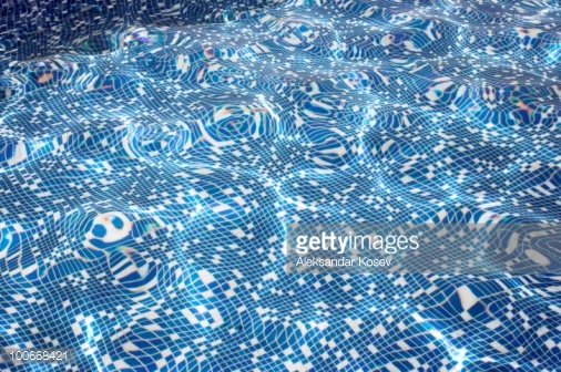
Photo by Aleksandar Kosev/Hemera / Getty Images
Bright
Lively
Splashy
Warm, buttery, or creamy.
Busy, crowded even, like looking at a swimming pool from above. We feel youth and abundance at once, almost too much, as if everyone in the pool were under 12 years of age.
Animated, like it could be (or is, or will begin) moving.
2, 3, or more colours in near-equal surface. Shell coral, ivory cream, and almond skin or pecan brown looks classic and neutral. Yellow green and gladiola orange with purple accents on a cream background is a Natural playground.
Images of suns, open flowers, a world at play. The lift we feel looking into the face of a daisy.
Curled elements not yet expanded, the energy of a spring, coil, or elastic waiting to release, like the unfurled heads of ferns.
Nature exaggerated, like animations or art/wallpaper for children’s rooms and breakfast nooks. An effect in excess of what the natural world actually provides is very good – more juicy colour, less blank space, more perfect and calendar worthy, less neutral area. On a Spring, this feels familiar, comfortable, perfectly normal and slightly euphoric, seeing what we anticipated (the end of Winter that we have always trusted and waited for) actually happening. Spring is an affirmation of the natural cycles of life. The feeling of “everything’s working as it should”.
Fairly large elements, at least a few, so that colours stay separate from social distances. Very clean separation between colour elements is also good. On some IAs, the risk is expressing so much control that it seems severe, but with Spring colours, this is quite hard to do. If anything, introducing formality is more challenging.
Introducing diagonal lines, especially good incorporated into boxy or linear designs like plaid to give movement and break up the steady beat.
Colour combinations that remind us of games – flags, school teams, regattas.
Features of Summer prints:
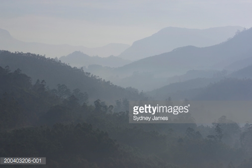
Photo by Sydney James/DigitalVision / Getty Images
Blurred and misted edges, looking through a haze, as Summer light that softens the borders between things.
Small design elements, or small enough to fuse together from social distances, in the principle of watercolour quilts. Textiles with a multicoloured weave, marled knits for instance. Close-ups on websites have value for seeing the colours but nobody will see the garment in that way. Decide on the item by making outfits with other colours in your wardrobe rather than isolating every component colour.
Use of pink and blue, especially together.
Pictures that bend, fold, sweep, glide like a porch swing, fly, gently swoop, or encircle each other, how many Summers use their hands. A folding textile creates the same effect. Summer people tend to be tactile. They enjoy touching food, fabric, flowers. Touching the printed fabric would feel like passing fingertips through a current of air, why sheer fabric and lace are so good.
When design elements are large, their colours do not stand out sharply from the canvas.
Flowers. Heavy blooms, peonies after a rain, and vines hanging down over an arch, fence, or pergola, like an outdoor pavilion.
Something chalky about the colours, like toothpaste.
Using off-white and gray or soft navy to simulate black and white.
Prints using colours of which some men would say, “These are different colours?” Nobody we know, of course.
Using elements of darkness to define the pastels. All 3 Summers require their darkness to prevent a powdery, pale, puff effect with no edges.
Circles, dots, specks, bubbles. A feeling of drifting.
Colours and patterns that we recognize as tradition. Red, white, and blue, for instance. Quilts. Money. A well-known painting style, cubism applying as much as impressionism, depending on the IA.
This Season group especially does well to study the many landscape images in places like Pinterest. Type the Season name in the Search box and a world will open up. It is understandably difficult to fully interpret the palettes into their visual potential. The final look is often more serene than necessary, with too much gray and muting. Think about how the landscapes would appear as fabrics, wallpapers, outfits, paintings, anything that helps visualize the same incredible “I wish I were there.” Sensation that Summer landscapes impart. True Summer is the ultimate clean laundry Season, the way it looks, feels, and smells. Soft Summer radiates composure and strength just by being here, and elevates these beyond anyone’s reach when she wears her full colour possibility. Light Summer shows us the profound joy in simplicity, giving the rest of us renewed perspective on our own lives.
Features of Autumn prints:

Photo by Sergey Novikov/Hemera / Getty Images
Autumn has incredible flexibility in the looks she can achieve, to the point that any style of print has the potential to work well. Chains and cuffs are perfectly placed for Autumn Classics. Naturals are perfectly easy, expected, no odd surprises, in dried flowers, the boxiness of wood, the Sultan’s tent, and the Fortune Teller’s coins. Dramatics use bold contrast elements, animal prints, and geometrics. It all works.
As with Spring, the warmer the colours, the more feeling of activity, the more colours look well when worn together. There are no limits in terms of combinations or area. However, with Spring influence, the more colour she wears, the better she looks. Autumn, with her incredible plasticity of appearance, she looks as well in neutral colour outfits, colours, or any combination of these. Autumn is the natural world as it really is, the earth as important as the blossom.
What would not work? Neither cartoons nor the very bizarre would be understandable to the viewer because the colours don’t convey the extremes. Fireworks wouldn’t get off the ground – meaning, Autumn literally feels grounded. The tendency is to look real and recognizable, not pretend, imagined, or invented.
Linear designs feel anchored. Crosses, diamonds, ladders, stairs, rows and columns. This may not be a strong feature in YinGamine prints, or it might be if the lines of the garment have many circular edges.
Elements that look like tapestries, a beautiful way to do florals. Texture is at least as important as print, if not more. Florals are easy, large and small. For Autumn, the colours bring the intention.
Less abstractions, more straight up element design. As with Autumn people, one is seldom left wondering what they are trying to say. Paisley as a depiction of falling leaves might be as abstract as it gets.
Elements that look made of metal - bronze, brass, and gold.
Repetition.
Elements stand out from the canvas or create texture impressions, both of which heighten the near-middle-far sensation in which Autumn specializes.
Anything that gets better with age. Patchwork, wine, cowboy boots, embroidery and fringe.
Features of Winter prints:

Photo by Redgreen26/iStock / Getty Images
Abstractions. Shape and significance are less clear, which speaks of detachment and distance. At night, when shapes are hard to make out, consequences are unknown.
Sudden. When colour appears, it does so forcefully. Elements are clearly distinct from the canvas and one another.
Silence. Vast expanses without movement, undisturbed and empty. In prints, this looks like large open or blank areas, often using neutral colours. In humans, we can see this appearance too as simple colour schemes, skin like an even blanket that is uniformly coloured without much natural flush, eyes that are the strongest colour in the face, and hair with more uniformity of colour.
Restricted use of colour, where the area of a third colour is smaller – but truly, this could be a rule to loosen a lot, applying it to the occasion where the garment will be worn. We have such beautiful prints today, and such freedom in how we dress and live. The worlds of textile, fashion, and social expectation are not what they were 50 years ago. For most Winters, the more colours in one part of the outfit, say a printed blouse or skirt, the quieter the rest of the oufit would be. Black and white are multitasking for this purpose. Perhaps Classics’ self-control will wear fewer colours than Naturals in the same outfit and accents will be smaller. Her poise could still look terrific in a Summer sailboat print the colours of which are Winter’s.
High value and/or colour contrast. The light elements might almost seem to glow. Areas need not be of equal size or involve black or white. Accessories work very well here. All black is boring on everybody. On Winter, an earring or a lipstick are enough the make a world of energy. Small energy-dense things mean a lot, the moment before a new star is formed.
Prints offer the ideal stage for wearing accent colours. Large areas of yellow, lime, orange, and even some browns and beiges, may be challenging for any Winter. Smaller areas add beautiful interest and creativity, so the garment looks very individual and yours alone. A Gamine will wear these colours in larger areas than a Classic who might use them more scarcely to add repetitive elements throughout an ensemble.
Something about ink, black, navy, or purple, which adds the mystery of night. This guideline applies more to an entire ensemble. An earring is often enough, for instance jet black stones embedded into a hoop if the rest of the outfit is light.
Incorporating Your Image Archetype
Depending on your particular combination of Image Archetype and Season, combining the two may feel overwhelming, as if there is too much information to take in, and for some as if the two are at odds on certain points, for example:
The size of print elements. Without getting overly confined to rules, consider your range an average between the Season and IA. Autumn and Summer YinDs need large print elements and wears huge florals beautifully. Autumn and Summer YangDs are fantastic in abstract design.
Use of contrast. Again, think of this as an average between Season and IA without overthinking it. Don’t worry about every-rule-every-outfit-every-time. The Perfect that we can strive for might not exist. A few elements from the suggestions above will be more than enough for the viewer to position the message as you intended.
Of course, Image Archetype plays a huge role in determining the best shapes to be used in print elements. Chiseled faces will look normal in chiseled prints. In rounded prints, they seem to push one another further apart so the face goes past statuesque to made-of-stone, and the print becomes frivolous and silly. However, since this has been covered extensively in the previous issue in the article about repeating your facial features, this time we will discuss how the IAs work with principles of design (balance, scale, contrast, rhythm, unity/variety, and texture) as opposed to elements of design (line, shape, color, etc).
Please remember that most types have a blend of elements, both of which can be borrowed from but will ideally honor their base Archetype first (ie Dramatic, Natural, Classic, Gamine, or Romantic) and secondary influence as a nuance or flavor in the total picture.
Design Principles for Dramatics:
Balance (symmetry/asymmetry) - More Asymmetrical than symmetrical, these are not people whose features are particularly balanced and hence overly balanced designs look static and unimaginative on them. Think of modern art, like a Calder statue swooping towards the clouds above.
Scale - Large, always, perhaps the most important thing to stick to, though keeping in mind that a 5’7” woman’s large scale and a 6’0” woman’s large scale are not necessarily the same
Contrast - Very high or virtually none, not in between. If the Dramatic woman is using high contrast, it should not interrupt her vertical line, splitting her into blocks and sacrificing one of her greatest assets.
Rhythm - Experimental, yet highly sophisticated, like Miles Davis’s Kind of Blue.
Unity/Variety - Unity is quite high, where the coordination of elements is important, variety tends to be low, as Dramatics typically use a single bold element to make a statement.
Texture - Smooth, sleek, polished, synthetic, with room for seasonal modification. What may look overly textured (suede, cotton velvet) on a Bright Winter may be plenty smooth enough on a Soft Summer. Likewise, the Bright Winter would be absolutely fine in a patent leather skirt, while the Soft Summer may prefer to restrain such a shiny texture to a shoe (where her Natural counterpart would perhaps not wear it at all).
Key Concepts: Dangerous, otherworldly, futuristic, awe-inspiring, abstract.
NOT cute, fussy, average, safe, or earthy.
Design Principles for Naturals:
Balance (symmetry/asymmetry) - Asymmetrical, like a cross section of a gem or a tree trunk, or in a hand-made object. The Japanese concept of wabi-sabi definitely applies, where overly pristine or perfect feels inauthentic on these people.
Scale - Medium to large, depending on the individual. Too small prints never have enough substance or presence to match up with the features here, though a print which has elements of highly varied size would be fine, as long as the repeat and overall effect is medium to large.
Contrast - Medium to high, though Naturals will generally defer to their season and individual coloring to determine their best contrast level. Winters here will wear free-form prints with a graphic contrast to them very well. Summers who love monochromatic schemes so should introduce at least a small element of another color to keep the overall impression from becoming too uniform.
Rhythm - Pulsing and shifting in tempo, with a sensuality that in music would make you want to dance, like the beat of a hand drum.
Unity/Variety - Low unity, high variety. Too much unity feels constricting and dull, too low a level of variety is not expressive and unique enough.
Texture - Almost any type of texture, and a mix of different textures is even better. Think of taking a natural landscape and introducing those mixes into the garment - gossamer cobweb and rugged tree bark, soft loamy earth and slick rubbery grass, etc. Spring influenced seasons may need to take care with the most earthy, heavily weighted textures, though in general all seasons of Naturals could do well to look for textures that occur in their natural environments - icy reflections in Winter, sea glass and sun baked driftwood in Summer, painted deserts in Autumn, and wet, dewy tropical plants in Spring for example. Christine has written volumes on the natural environments and textures for the seasons which I highly recommend having a look at if you have not.
Key concepts: Organic, artistic, expressive, fluid, relaxed
NOT controlled, prim, static, severe, synthetic
Design Principles for Classics
Balance (symmetry/asymmetry) - Symmetrical, on this person deviations from the mean are greatly exaggerated because of the natural balance and symmetry of their features.
Scale - Medium, smaller women will wear medium-small and larger women will wear medium-large but classics in general do not suit very large or very small prints, as their features do not tend to be very large or small.
Contrast - Medium to low, excepting Winters who will need contrast to retain balance and symmetry with their coloring. Contrast for Winters in these types is best applied symmetrically and as evenly head to toe as possible (ie: and all over black and white print, a white dress with black necklace, belt, and shoes, and so on).
Rhythm - Measured, repeating and logical, like Baroque music.
Unity/Variety - High unity, low variety. Design elements must be highly coordinated to feel rational on a Classic woman and too much variety in a design will tend to eclipse the relatively simple design of her face.
Texture - Smooth to subtly textured, though it is best when textured fabrics have a traditional quality to them, something like a harris tweed. As with Naturals, there will be some variety based on season here, though in general classics will always use textures subtly while Naturals will exaggerate it.
Key concepts: Traditional, organized, calm, elegant, familiar
NOT: Aggressive, erratic, free flowing, noisy, strange
Design Principles for Gamines
Balance (symmetry/asymmetry) - Asymmetrical and symmetrical elements may be mixed or use individually, though symmetrical elements will need some other kind of “surprise” about them to keep the energy and interest level high.
Scale - Small to medium, these people usually have a delicacy and smallness of features that is well repeated in small to potentially very small design motifs. One single large design element per outfit may, however, be used to create punctuation.
Contrast - High, as high as the palette will permit. In seasons with low value contrast (ie: light to dark), hue contrast (using colors across the color wheel from one another) can be hugely effective, a Light Summer combining her pepto pink with mint green, for instance. Some monochromatic schemes may be used in the Summer seasons but it’s better if they’re unexpected, say Soft Summer’s coolest, lightest mauve with her darkest, warmest red.
Rhythm - Uptempo and staccato to the point of being about as much as can be processed, like a snare drum or punk music. Languid and lethargic design rhythms pin their fairy wings to the ground.
Unity/Variety - Unity may be low or high, but variety must be high (indeed, it might be hard to overdo it). Unlike the Natural, Gamine women suit coordination and even repetition of elements surprisingly well so long as there is enough interest being created by sufficient variety. Unlike the classic, they don’t necessarily require a highly unified look, though more mature women in these types may prefer it.
Texture - Unexpected or otherwise smooth. Many synthetic (and especially sparkly or shiny) textures like patent leather, creative faux furs or sequins find a comfortable place here, as do uses of textures one never thought could go together.
Key concepts: Inventive, animated, upbeat, graphic, witty
NOT: Reserved, relaxed, staid, plain, somber
Design Principles for Romantics
Balance (symmetry/asymmetry) - Mostly symmetrical, though not rigidly so, enough permission of asymmetry to allow for a high level of ornamentation.
Scale - Medium to small, depending on the woman.Care must be taken with very feminine motifs not to become too little girlish at a very tiny scale. Designs should be large enough to feel lush and womanly without being so large as to overwhelm her, though they can be made up of very delicate components.
Contrast - Low contrast gives the softest impression and is more flattering to her curvy figure. Winter women will bend the rules here by introducing contrast in prints or in small areas that do not break apart the figure.
Rhythm - Undulating and slow, like honey dripping off of a spoon, a quality found in some Tango music. May be more uptempo if the effect creates a lot of ornamentation, like a Flamenco guitar.
Unity/Variety - High unity, medium variety. Romantic women suit coordination best, however some amount of variety in motifs is needed to keep things from being too plain.
Texture - Soft, smooth, or fluffy, textures you want to reach out and touch. Anything too slick or too rugged will be strange next to her very yin features, including Autumn and Winter women. Sparkle also suits very well.
Key concepts: Soft, ornate, luscious, glamorous, precious (as in, materials)
NOT: Rough, heavy, minimalist, hard, edgy