Leaving an Impression

We leave you with a two-part article, one from Rachel and one from Christine, continuing from this issue's theme of making a statement.

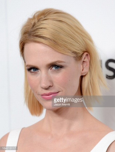
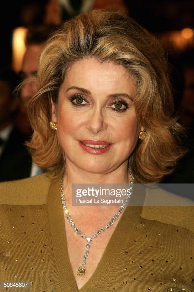
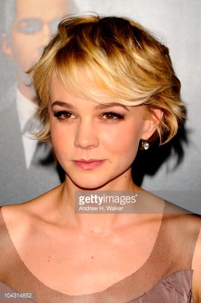
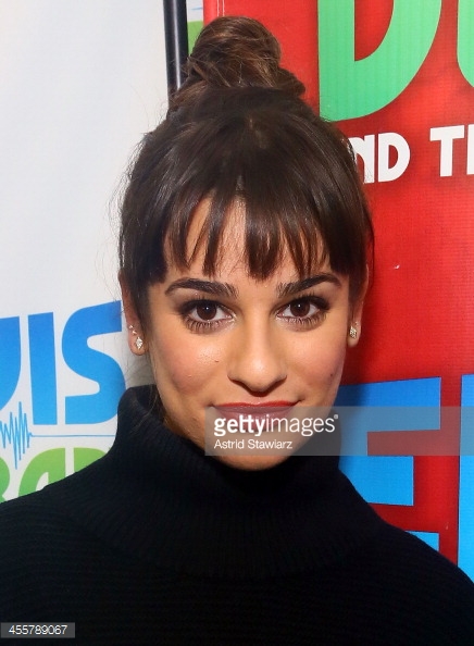
Statement Focal Points by Rachel Nachmias

A portion of this article excerpted from The Curated Wardrobe

Each woman’s style, and hence her way of building outfits, is unique. But to make it easier, I have broken down the core parts of an outfit that can be applied to create any effect. Every outfit should have basics, a statement focal point, a finishing piece, and basic accessories. Most of my clients come to me wearing outfits that are missing some of these parts, which tends to mean their outfits look unfinished, bland, or both. Since you, like most of my clients, probably have a good understanding of what basics are and have a closet full of them, I’ll skip on ahead.

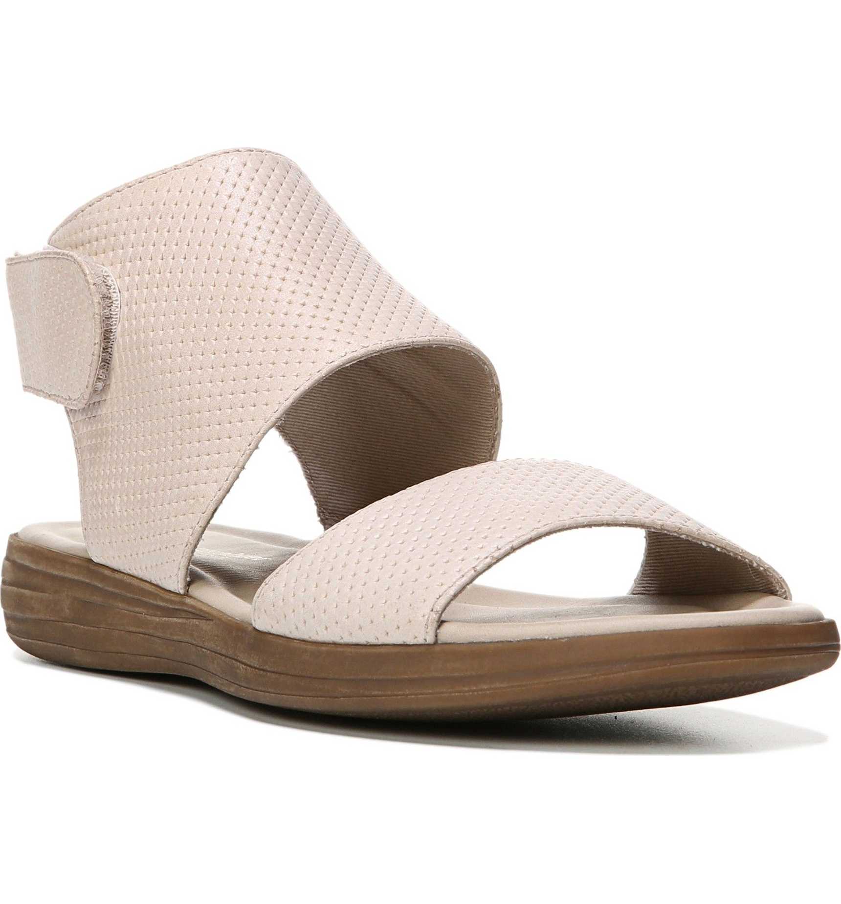
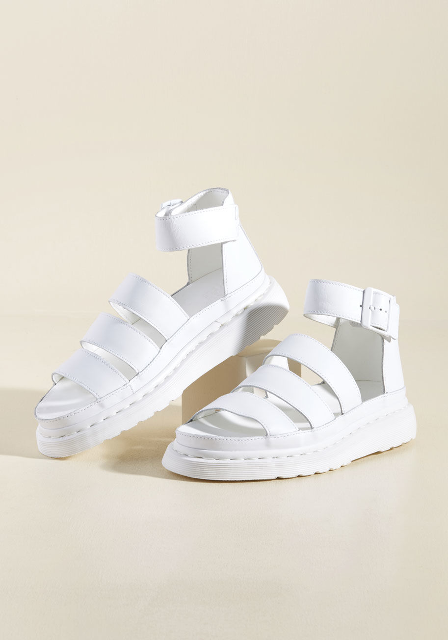
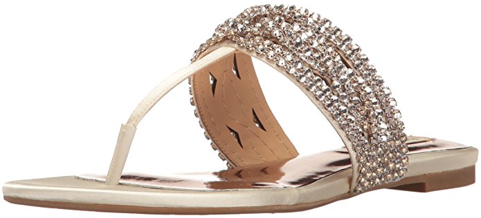
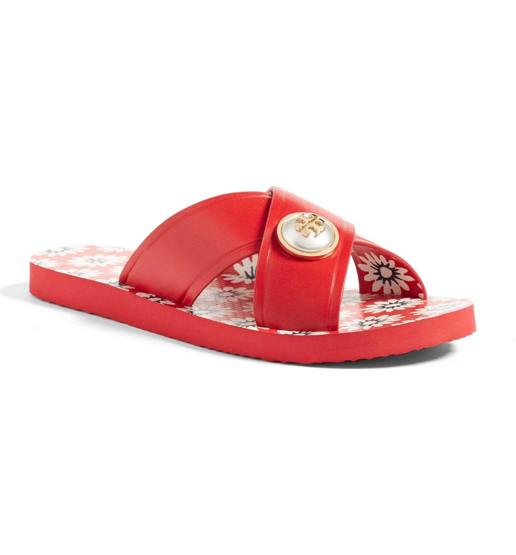
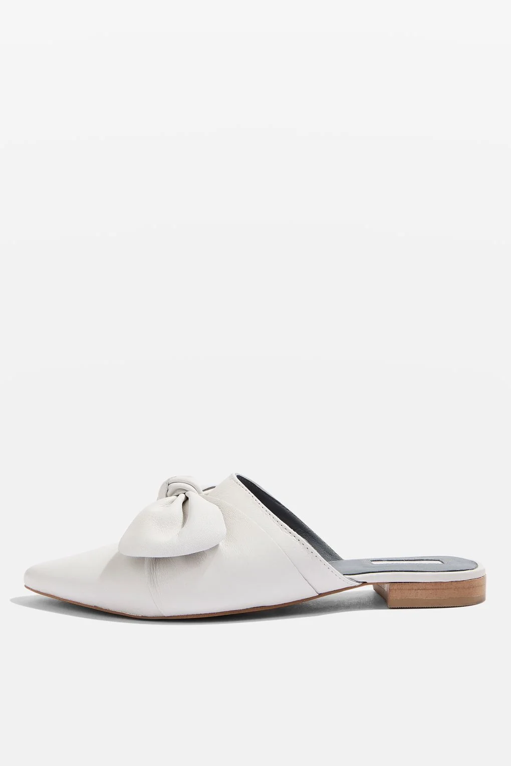
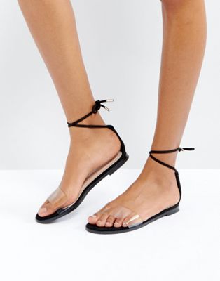
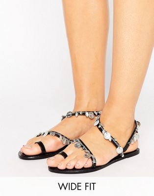
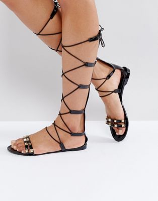
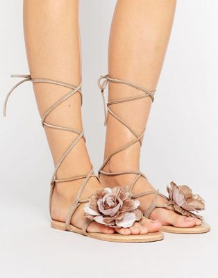
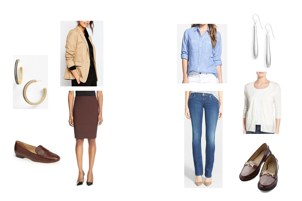
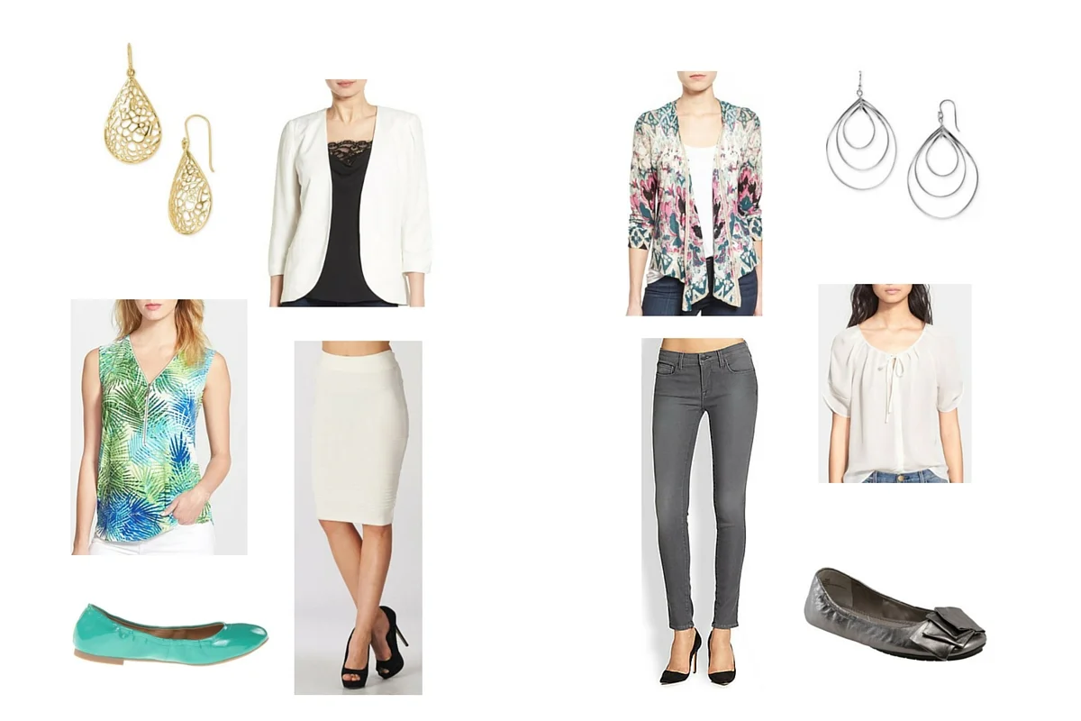
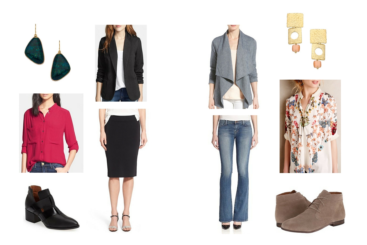
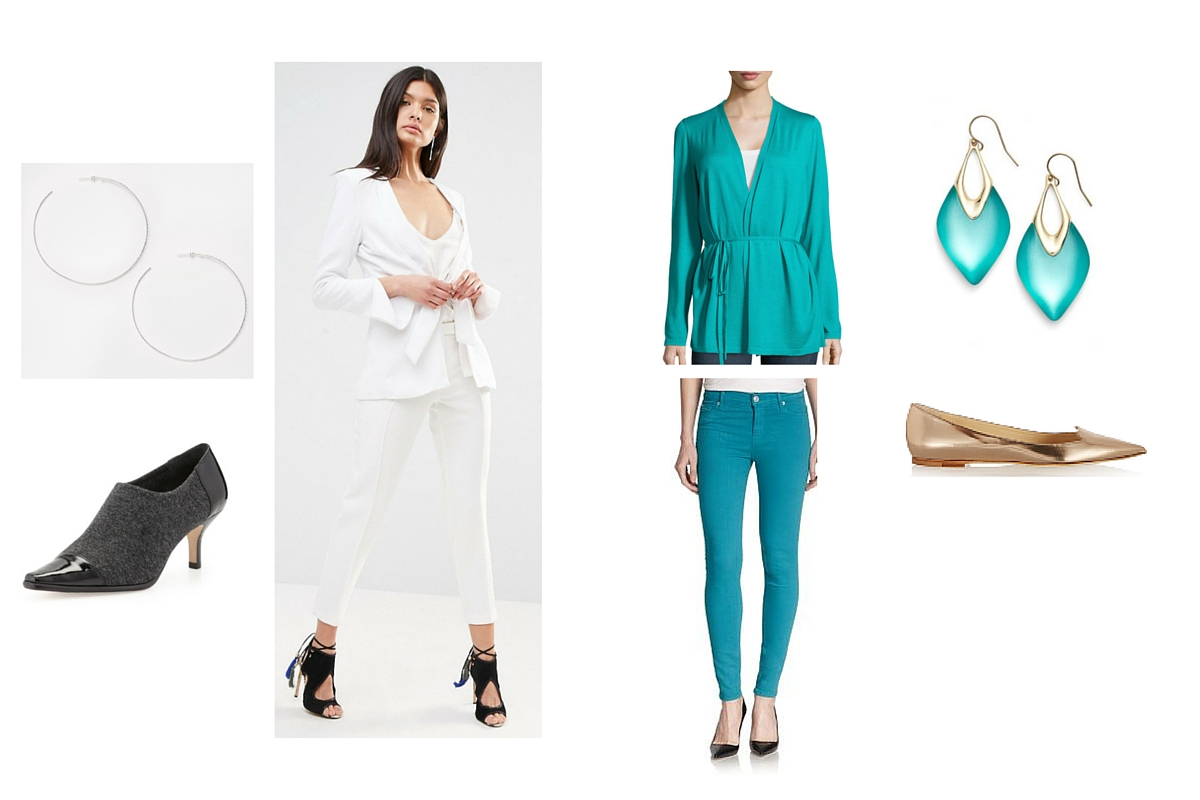
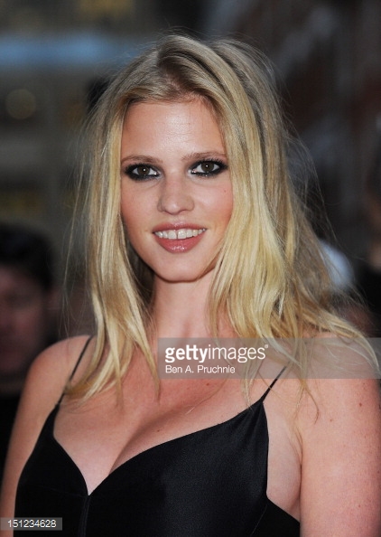
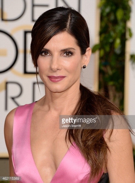
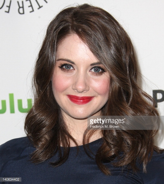
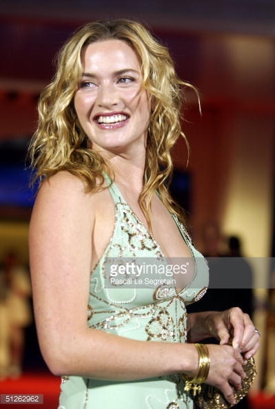
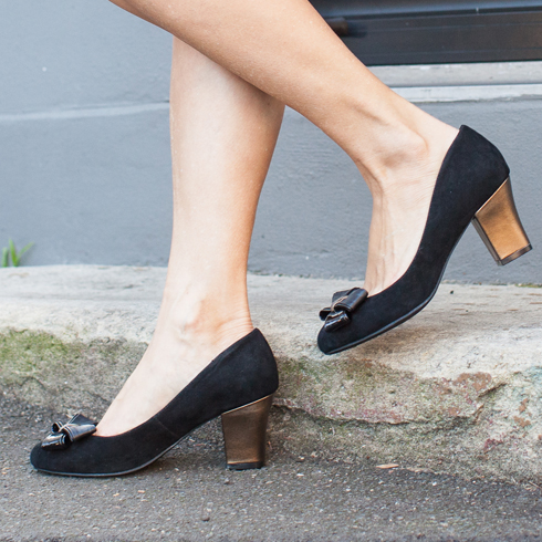
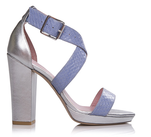
Almost universally, my clients are missing statement focal points in their outfits. Every outfit, like any other artistic composition, needs a place for the viewer’s eye to go. When the eye meanders without a stopping point, it struggles to bring the whole composition into focus—which is an artsy way of saying that it gets bored. A statement focal point can be any part of the outfit, from a blouse to a pair of earrings or even shoes, it just has to have the power to draw the eye. One trick I like to use for a quick wardrobe boost is to use jewelry this way, (hence the topic of this issue) since it can be worn with lots of outfits that may be lacking a focal point. What will qualify as a statement focal point will vary depending on your physical design and your style, but in general, these pieces tend to have a color, pattern, design detail, material, or larger scale that stands out. Simple, neutral, solid pieces in common fabrics don’t tend to draw the eye (those pieces would be basics).

This issue is packed with examples of pieces that qualify as a statement focal point, but I find identifying these pieces on one's own (especially relative to one's personal style and physical design) is something that can be hard to learn, so allow me to break it out a bit further. A small catalog of illustrations of these concepts can be found here: https://hueandstripe.com/catalog/116H&SteLQ

Color

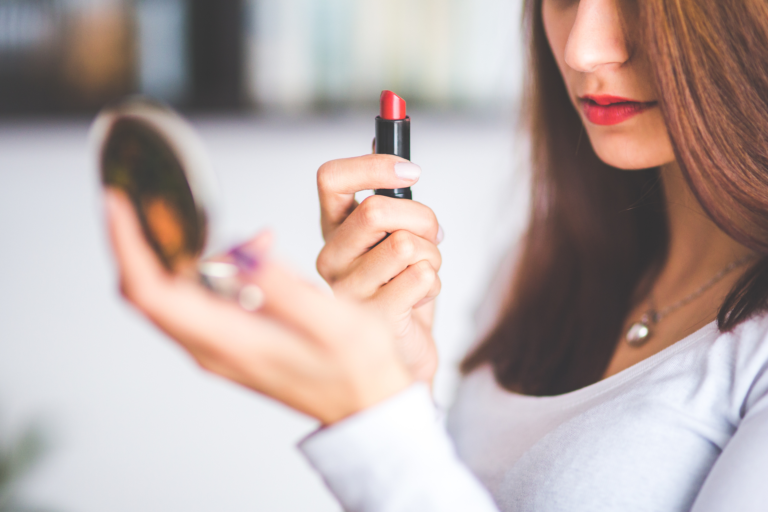
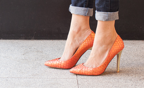
Color is one of the easiest ways to create a focal point, but it's also dependent on the type of color and the overall color composition of the outfit. A color piece becomes a focal point when it is more eye-catching than the other elements at play. The most typical reason this happens is due to some form of contrast (where it is critical to remember that contrast is relative to the innate contrast level of your palette). Value contrast (i.e. a bright silver necklace on a black dress) can be used this way, but more commonly it is some form of color contrast that is used.

A more colorful choice from a particular palette against a neutral ground is one of the easiest techniques to employ, though interesting effects can also be created by playing warm against cool, even for the true seasons who each have purple and blue as well as red and yellow in their palettes. In any composition, warmer objective hues like red and yellow (more from Christine on red in a moment) tend to come forward most, something to keep in mind if your style involves a lot of multicolor effects. 

Design detail

Detail can be defined as "complexity of shape", meaning that there is more complexity to the design than the bare minimum necessary to construct the garment and be able to take it on and off. This might be something as simple as oversize or contrasting buttons, or as over the top as a giant ruffle, depending on your image archetype and personal expression of said archetype. Detail does not need to be structural in any way, as is the case for example with a beaded applique.

Material

Fabrics can have a tremendous effect on how predominant a particular item is in the composition.  Some textures and finishes draw the eye more than others - an oversize coat in a smooth black wool might feel very basic, while the same in goat hair would be a statement. It's not just rugged textures that can have this eye-catching effect, as reflectivity can hugely affect a garment's power to draw the eye (one of many reasons why jewelry is such an easy item to use in this way). Certain sheer textures can also have this effect, as can a wide array of other fabrics that diverge from the norm of smooth, flat and opaque.

Scale

Probably the simplest method of all of creating importance in a piece is to just make it bigger. Of course, it should be noted that scale is relative, so in order for this to work, the object in question must be large relative to the person wearing it, to the other objects in the composition, or than that type of object would normally be, or very likely more than one of these factors. 

Pattern

Pattern is an excellent way to create a focal point, but not ALL patterned items are focal points. A scarf with a soft monochrome watercolor print might not be enough to draw the eye, and some women even enjoy wearing more than one pattern at once, in which case one will have to be more dominant. I've left this one for last, because what makes a pattern a focal point can be a combination of any of the elements previously mentioned.

As with color, contrast is one way patterns become more prominent in the composition, but not the only qualifying factor. Shape is also at play - we tend to focus better on shapes with crisper lines, so more graphic prints will tend to pull focus more. Of course, this goes hand in hand with scale, as defined above, where larger patterns tend to have more impact. 

Finally, there is one last thing to mention here, which is motif. Recognizable motifs, which can be as basic as flowers or as esoteric as dinosaurs, tend to draw the eye more than abstract ones. It's human nature to want to look at an assembly of shapes and pick out flora, fauna, and other familiar objects. So a blouse with little birds catches the eye more than little dots. This is especially true when the motif is instantly recognizable yet unusual in context, as it would be if we made our little birds into little eyes. 

Depending on your unique factors - season, body type, preferences, lifestyle, age, etc. some of these tools will work better for you and others not at all. You might employ one approach all the time, or vary it day by day. But if you change one thing about your outfits, make it this. Statement focal pieces have the most power of any outfit component to communicate something about you to the world, so they represent a huge opportunity for you to express yourself and define how you want to be seen. 


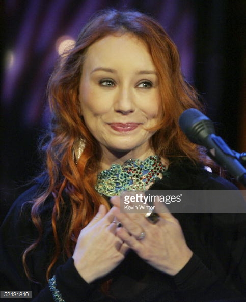
Make a Statement with Undertone

By Christine Scaman

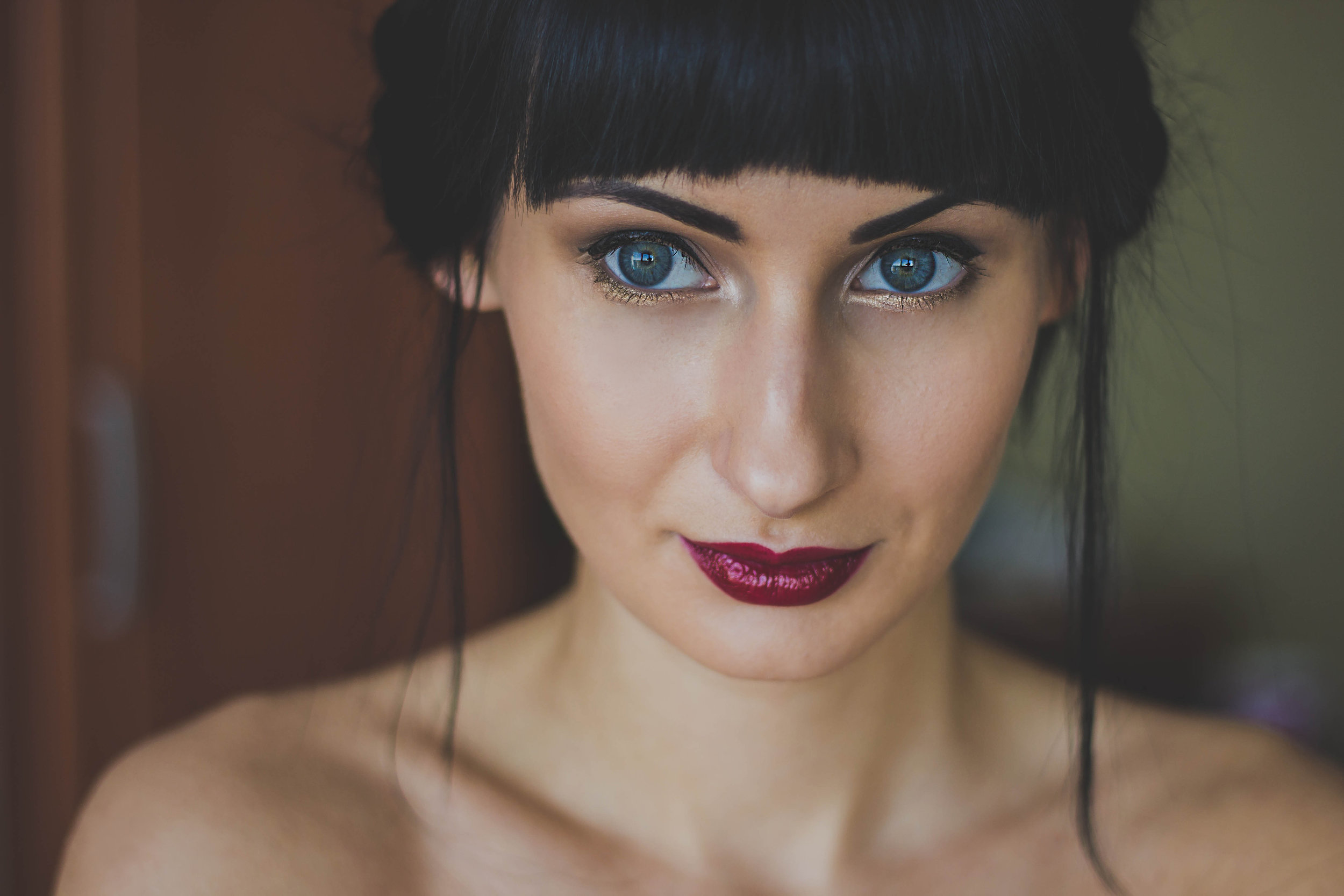
Undertone is a concept that we hear about often, related to many aspects of appearance. With cosmetics, it usually refers to the warm-neutral-cool base of foundation.

If there were only one meaning, there would be no confusion. Although we often see (and I have used) red for Winters, blue for Summers, yellow for Springs, and orange for Autumns, these may be better referred to as core colours for those applications that use colour energy for well-being and healing.

Today, I think of colour analysis undertone as the colour in the base layer of skin, where the blood flows through the capillaries. The colour will be some variation of red and probably moves through a range for people within a Season. Whether the red colour is a result of humans having different colours of blood or it is the red seen through the filter of the other pigments in the overlying skin, and even the walls of the blood vessels, is unknown to me, but it is true that every type of colouring (Season) has a range of reds.

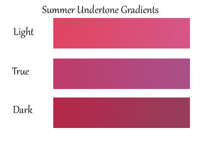
Instead of a pinning down a single red, which may not be possible, or even exist, the best use of undertone may be as a gradient. When we wear these colours, the viewer senses the energy and alignment. They create visual excitement, as red always does, and have a powerful capacity to improve our appearance.

Harmony is another word with more than one interpretation. It has one meaning, which is overall agreement, but we may agree or disagree about when it is achieved or when it becomes disturbed.  Colour analysts are taught how to measure its effects and appearance, but there is always the component of how colour feels to each one of us. People within a Season share the same reactions to colour and they paint their own artistry on top.

Variations of the same flavor or scent widen our experience of how to world could be, still sharing what the flavor or scent have in common. Few cooks are putting banana into tomato basil soup and I don’t see orange and camel in anybody’s True Summer Pinterest boards. The system is here to give us structure; we know where we fit and can explore our territory safely. Our coaches, who might be our colour analysts and friends in our Season groups, guide us to discover our colours in a supported way.

Over time, all of us here have come to realize the intelligent compromises that shopping requires. Few items are perfect in every way and nor do they need to be. We have so many layers in our beings that the average person within a Season barely exists. Shopping can be a quest, a frustration, a game, and a simple appreciation for visual beauty.

When an item hits the bull’s eye in all of its colours, we recognize harmony, the sense of global peace or agreement. We might find it in different colours and combinations, but in general, humans share much more than they differ in how colour energy is felt. As always when presented with the opinions of others, our job is to check in with ourselves and decide if we feel the same way, and if not, then how do we feel.

Below, the four panels present an idea for the gradients that might belong to the 12 Seasons. The colours are far from absolute and are suggested as a more practical, and perhaps realistic, way of thinking about undertone, instead of a theoretical concept that is so confined as to be of little use.

Gradients of light to dark ranges could be overlaid on the reds, and many other gradients too, as colour and human beings acquire complexity. I stayed in the medium ranges to keep the darkness levels similar to that of blood and be easier to compare.

SpringUToneGradients.jpg
SummerUToneGradients.jpg
WinterUToneGradients-web.jpg
AutumnUToneGradients-web.jpg

Following that is a link to a catalog showing necklaces that might illustrate an undertone colour especially well, or feels harmonious in its colours to my eyes and energy, or illustrates the Season especially well or unusually, along with some informal conversation between friends. But don’t take my word it. Use the pictures as a springboard to discover your own feelings and opinion.

https://hueandstripe.com/catalog/112H&Sp0iS


Closing Signature/STYLE


As we bring Signature/STYLE to a close, we would like to extend our sincere thanks to you, our readers.  I hope that we have learned from one another as we saw colour and style through one another’s eyes.

The lists of email addresses will be deleted on January 30, 2018, as will the entire account.  There will be no record of the names and email addresses on our subscriber lists.


Sometimes A Sandal is Just a Sandal

Most readers will have reached a point in their style journey where they become aware that style is much more than knowing whether to wear this t-shirt or that one for the best effect. Understanding the fine points of Season and Image Archetype is one thing, putting them into practice in our actual lives is another. By far the most common question I receive from analyzed clients is about this. It can sound a few different ways, but some of the most popular versions are these:

“I get why I’m this type but it just doesn’t feel like me.”

“I love my archetype and I see how it flatters me, but it’s just not practical.”

“I love my archetype and I see how it flatters me, but no one else I know dresses like this and I feel weird being the only one.”

“I just feel so unfeminine, am I really THAT yang/dark/severe?”

“I just feel so fussy, am I really THAT yin/cutesy/light?”

And so on and so forth. I’m sure there are dozens of lenses we could use to examine this phenomenon, but whenever I am looking to investigate human motivation, which is the source of our idealized self-images, I turn to the enneagram. The enneagram is an incredibly layered and deep system, which sadly is only familiar to most people in the form of very oversimplified quizzes if at all. It would be impossible for me to explore in one article all of the nuance that the enneagram can explain when it comes to what works and doesn’t work for certain individuals as far as their image goes. So today, I would like to examine just the most primal level, namely the Instinctual Subtypes (also called variants by some schools).

When most people think of enneagram, they think of their type number, 1, 2, 3, etc and sometimes of their “wing” i.e. 1w2 vs 1w9, a leaning towards one of the types to either side, which is certainly a major piece of the puzzle. (If you don’t know the enneagram at all, I highly suggest watching this education tv series to get a basic understanding and maximum value out of this article) Instincts, however, are even more dominant in our personalities. To quote my enneagram teacher, Katherine Fauvre:

“The personality is made up of the primal needs, the ego and the higher essential qualities. The instinct as the most primal aspect of the personality is dominant and always in charge of the defense system. Type and Tritype are secondary to the instinctual stacking.”

Everything we encounter filters through this defense system, and most certainly our personal style and way of dressing does. How we are perceived by others and how our bodies feel in our clothing are important when it comes to assessing potential threats. Despite modern living conditions afforded to likely every one of the readers here, we are all hardwired to constantly scan for threats, as we inherited our brains from our ancestors who needed to be sure they didn’t get eaten by lions on a regular basis to survive.

The three instinct are know in the enneagram world as self-preserving, social, and sexual (sometimes also called 1-to-1), and it’s important to note that we all can, and need to, use all three. However, we have a preferred order in which we use them, and our top choice is the one we tend to “overuse”. This overuse is something we can temper with awareness, but the tendency will always be with us and will always color our experience.

If you have the self-preserving instinct, you focus primarily on your own physical survival, and on the availability of resources such as food, shelter, money, energy and time. If you have the social instinct, you focus on belonging to the group and your role, identity and status within the group as a means of survival. If you have the sexual instinct, you focus on creating deep intimate bonds with a special someone and on what is needed to attract that special someone as a means of survival. It’s likely that you may relate to more than one or all of these at times, but one is always dominant. It may help to think about which of these arenas is most likely to cause you to behave badly. I can also recommend taking the relevant test at enneagram.net.

Depending on your combination of instinct type and Image Archetype, you may experience different types of friction (or, more rarely, none at all). It is my belief that there is always a way to express both, but it may require some thinking outside the stereotypical box. In this article, I will explore the different combinations and show examples using this issue’s topic item, sandals.

The Self-Preserving Instinct

The self-preserving Instinctual Subtypes focus on “survival, safety, security, and a sense of well-being”. (Katherine Fauve, Enneagram Instinctual Subtypes, p17) The unconscious belief of the type is “I am my body”, so the physical status of the body, and the resources needed to maintain that status, are always top priorities. As such, concerns such as comfort, practicality and durability must always be met for this type to feel at home in their clothing. I’m reminded of one of my all-time favorite scenes from The Office:

https://www.youtube.com/watch?v=g_SucqP2XHY

For all of us, comfort matters at some threshold, but for the self-preserving person being comfortable and free to move subconsciously feels like a matter of life and death. I have had clients agree to work together only on the condition I wouldn’t force them into uncomfortable shoes! It’s important to note that these threats, as for all Instincts, are real or imagined, so even shoes that simply look uncomfortable or impractical can trigger distress. There is a down-to-earth and grounded quality to her, and she usually prefers Natural clothing the most, though her attraction to simple, traditional and subdued clothing may also mean that the aesthetic of Classic appeals.

The Self-Preserving Dramatic

YangD shoe: http://shop.nordstrom.com/s/naturalizer-fae-sandal-women/4549425?origin=category-personalizedsort&fashioncolor=BEIGE%20LEATHER Beige Leather SSu or any Su; Blk leather any W; Blue leather SA SSu ; Pink Leather SA TA

This woman usually sees herself as a Natural before analysis, though depending on type and tritype she may enjoy the exceptional quality of the Dramatic types, and yet comfort is still king. Self-pres Instincts eye shoes without sturdy soles and a visible amount of cushioning and support with suspicion, so those are non-negotiables. This style of shoe, which attaches securely to the ankle and doesn’t flip or flop while walking also tends to be preferred, as she is always concerned with whether a shoe will inhibit her ability to move freely and without thought to what is on her feet. Despite these qualities, this shoe retains a modern sleekness and a sci-fi quality, like a shoe for climbing a mountain from the world of Logan’s Run.

The Self-Preserving Natural

Yin N Sandal:

http://shop.nordstrom.com/s/kork-ease-myrna-2-0-cork-wedge-sandal-women/3914555?origin=category-personalizedsort&fashioncolor=DENIM%20FABRIC&cm_mmc=Linkshare-_-partner-_-10-_-1&siteId=je6NUbpObpQ-2prMo_rkkIffL1Fi8sUmfQ In Black Suede for Darks, Black Leather for any winter, Blue Leather for Light Spring, Grey Patent for Bright Spring, Light Grey Suede for Soft Autumn, Natural Patent for Dark Autumn, Orange Leather for True and Light Spring, Rust Leather for True Autumn, and Soft Gold Metallic for Light Summer.

This is the most common instinct among Naturals, perhaps even more so than being the most common instinct in the population at large. They usually feel quite comfortable in their type, though for some the relative flash and impracticality of certain more boho items in these types is enough to make her ill at ease and not line up with her self-image. She will tend most often to choose that within the type which is simple, clean, unfussy and practical. The above sandal is a good example of the direction her aesthetic preferences tend to veer in, in addition to ticking the boxes laid out in the Dramatic section above with regards to comfort and ease of movement.

The Self-Preserving Classic

YangC sandal: http://shop.nordstrom.com/s/born-tegal-sandal-women/4507416?origin=category-personalizedsort&fashioncolor=RED%20LEATHER Red leather TA ; Brown Suede SA ; Grey leather LSu; Pink Leather TSu TW ; Turq leather TSu

Though she often admires classic styles, she generally has questions about how exactly to manage her needs while dressing in more tailored styles. I suggest a two-pronged approach, which on the one hand involves adjusting one’s perception to discern the difference between “comfortable” and “comfortable-looking” and on the other hand involves finding places to stealthily insert more comfortable elements into one’s wardrobe. This shoe maintains a reasonable degree of elegance and composure, while being very much designed for the sort of long walks self-preserving types like to remain prepared for.

The Self-Preserving Gamine

YangG shoe: https://www.modcloth.com/shop/shoes-sandals/flatform-performance-leather-sandal/10081386.html?cgid=shoes_sandals_148&dwvar_10081386_color=WHT White TW BW; Blk Darks ; Cherry Darks

Like all self preserving types, she would have liked to be a Natural, but she sees that something isn’t working with those clothes. Natural clothes can look like they’d be more comfortable than they actually are because of the disconnect in scale on this woman. She usually doesn’t mind being quirky, except when it interferes with practical concerns. Fortunately when it comes to footwear, a little chunkiness can be used to great effect for both gamine types to juxtapose against more delicate elements of an outfit in an unexpected way. Here, a shoe that looks like you could climb mountains for the next 30 years that still reads and trendy and fun.

The Self-Preserving Romantic

YinR sandal: http://shop.nordstrom.com/s/lamour-des-pieds-brenn-ankle-strap-sandal-women/4059232?origin=category-personalizedsort&fashioncolor=BLACK%20SUEDE  Blk W; Cognac SA TA ; Scarlet DA

I don’t see this woman a lot but when I do, she usually would have much preferred to be a natural, or anything less fussy. Footwear is one thing self-preserving types tend to be most sensitive to, so it becomes necessary to find styles that meet their standards of practicality while still being able to make logical outfits with the type of clothing which is flattering to her. These sandals would definitely work for other yin types, but overall they have a subtle retro quality with a heart-shaped toe that would look pretty and normal among other Romantic items.

The Social Instinct

The social Instinctual Subtypes focus on “people, recognition, popularity, honor, status and social acceptance”. (Katherine Fauve, Enneagram Instinctual Subtypes, p19) The unconscious belief of the type is “I am my group”, so a sense of belonging and status within the group, are always top priorities. As such, concerns such as fitting in and playing their role within the community must always be met for this type to feel at home in their clothing.

For all of us, feeling included matters at some threshold, but for the social person looking appropriate and appearing as part of their group subconsciously feels like a matter of life and death. This can be the hardest subtype to identify, because depending on the group they are a part of, they may prioritize very different things - i.e. a client who lives in Seattle vs NYC.  It’s important to note that these threats, as for all Instincts, are real or imagined, so even clothes that seem like they could cause exclusion from the group can trigger distress, whether or not that is true. She is friendly, considerate and self-sacrificing, and as mentioned she may look wildly different depending on her social environment, however a common theme is an attraction to status symbols, which may mean Classic items like a strand of pearls or something else entirely.

The Social Dramatic

YinD Sandal: https://www.amazon.com/dp/B01MF71FQD?tag=viglink27870-20 Ivory for Lights, Black for any Winter, Rose Gold for Brights, and Silver for True and Light Summer and the Brights.

Concerns among social instinct types of these IAs can be myriad for the reasons mentioned previously, but numbering among them might be looking bizarre or garish. (Another very common concern is “being too dressed up” and drawing commentary, the remedy for which might look similar to that which was outlined for the self-preserving types.) This shoe does glitz and glamour in a way that remains polished and contained and relatively familiar, in a sense that it would feel at home in any country club.

The Social Natural

YinN shoe: http://www.asos.com/au/asos/asos-farlorn-leather-plaited-sandals/prd/6944365?iid=6944365&clr=Silver&SearchQuery=&cid=17170&pgesize=36&pge=3&totalstyles=462&gridsize=3&gridrow=9&gridcolumn=2 for the social instinct, also YinC  ; brush silver n tan, any 5 Su, lo C for W (N would overlook tan sole)

The social instinct type in these IAs may fear looking messy, sloppy or inappropriate. I have a visceral memory of a particular Natural client of this subtype who began to cry as I read off the guidelines for her type, fearing that she would be doomed to looking like a surfer who had just washed up on shore. She almost never cares for bohemian looks unless that’s what everyone around her is wearing (for example, a lot of women in the health coaching profession feel pressured to look hippy-ish). This shoe could easily be worn by YinC as well, but most importantly is subtle enough in it’s natural detailing to easily blend with a more contemporary, less artsy take on the type.

The Social Classic

7705398-1-silver.jpg

YinC sandal: http://www.asos.com/au/faith/faith-jenson-embellished-flat-sandals/prd/7705398?iid=7705398&clr=Silver&SearchQuery=&cid=17170&pgesize=36&pge=2&totalstyles=463&gridsize=3&gridrow=6&gridcolumn=3 v pretty seashells and lt tan LSp BSp

She is usually happy enough to be a classic, which at face value seems to be perhaps the type with the most innate connection to the idea of having status, however her inherent aversion to low status within the group can mean that she fears being too boring in certain iterations of the classic types, especially if she is under 40. If her peer group is having fun dressing up for a party, she definitely doesn’t want to be the only one looking stodgy and traditional. She can often be attracted to gamine styles, or what she might perceive to be gamine styles, like the above. Which is not to say a gamine couldn’t wear these shoes, but simply that when paired with a simple outfit one little detail like this would be highly apropo for summer in general or especially any occasion for which the seashells would be thematic.

The Social Gamine

YinG Sandal: http://shop.nordstrom.com/s/tory-burch-melody-sandal-women/4597756?origin=category-personalizedsort&fashioncolor=NANTUCKET%20RED%20%2F%20%2F%20NAVY%20SEA Nantucket red Brights;  Navy LSu SSu DW

This gamine tends to be apprehensive of standing out or looking strange, and tends to swing her style more towards classic with a playful twist, perhaps with a bit of a preppy aesthetic. There are exceptions but she tends to be the most comfortable with cutesy, especially if the sexual instinct is last in her stacking order. Not necessarily a bad thing, but she does still need to exaggerate things just a little more than a classic would, and suits having a little more going on. This sandal takes the idea of a preppy sandal with a pearl button and blows up the scale and adds an animated print - relatively subtle, but the animated proportions do make a difference on her. Of course, styling would also be key with these. Something like a second, different print like a polka dot somewhere in the outfit and plenty of graphic contrast would keep this in her realm.

The Social Romantic

YangR slide: http://us.topshop.com/en/tsus/product/kara-pointed-flat-mules-6582161 grey, any winter

More than being too flashy, the social instinct Romantic tends to be more concerned with being too sexy for her role; i.e. too sexy for a mom picking up her kids, too sexy for her age, etc. She is drawn to classic but doesn’t like how it looks on her, and often even more drawn to gamine because it satisfies her need for detail without triggering her fear of being inappropriate. A reasonable remedy might be to balance the vavavoom of these types with a healthy dollop of sophistication, as in the shoe above. Together with a beautiful, feminine blouse and a pair of well-fitted jeans, they would look mature and sophisticated anywhere.

The Sexual Instinct

The Sexual Instinctual Subtypes focus on “intimacy, pair bonding, chemistry and one-to-one relationships”. (Katherine Fauve, Enneagram Instinctual Subtypes, p21) The unconscious belief of the type is “I am my relationship”, so a sense of closeness and twinship with a “special someone”, are always top priorities. As such, concerns such as feeling feminine and attractive and standing out must always be met for this type to feel at home in their clothing.

For all of us, intimacy matters at some threshold, but for the sexual instinct person feeling attractive, feminine and unique subconsciously feels like a matter of life and death. It’s important to note that these threats, as for all Instincts, are real or imagined, so even clothes that seem like they might make them undesirable can trigger distress, whether or not that is true. There is a sensual and intense quality to her and she is often attracted to Romantic styles or anything overtly sexy, flashy or glamorous, like a peacock displaying its feathers.

The Sexual Dramatic

YangD Sandal: http://www.asos.com/au/prettylittlething/prettylittlething-strappy-sandal/prd/7907832?iid=7907832&clr=Black&cid=17170&pgesize=36&pge=0&totalstyles=466&gridsize=3&gridrow=12&gridcolumn=2&utm_source=Affiliate&utm_medium=LinkShare&utm_content=USNetwork.1&utm_campaign=je6NUbpObpQ&link=10&promo=324006&source=linkshare&MID=35719&affid=2135&channelref=Affiliate&pubref=je6NUbpObpQ&siteID=je6NUbpObpQ-r1jCLjdq9tGI7nWg7SlQsg Any Winter and Bright Spring

She is usually quite thrilled to be a Dramatic type, and it can be quite healing for her to understand her own version of sexy, which is so much more effective than trying to shoehorn herself into Romantic clothes (often she will think YangR but can’t seem to make it work). If she is Yang D she will need to see that her choices extend beyond the realm of androgynous tailoring. Here, a shoe that is modernist and minimal, but also definitely unique and sexy in the Dramatic’s signature way.

The Sexual Natural

YinN Sandal: http://www.asos.com/au/asos/asos-finland-wide-fit-leather-coin-flat-sandals/prd/7503512?iid=7503512&clr=Black&SearchQuery=&cid=17170&pgesize=36&pge=2&totalstyles=463&gridsize=3&gridrow=9&gridcolumn=2 For any Winter

Probably the rarest instinct in Naturals, though I have been told the same holds true for the general population. Like most sexual types she can have a propensity to self-identify as a Romantic. At times, she is deeply upset to learn she’s a Natural, particularly when she sees herself as a woman who wears pinup bombshell styles, but there are many sexual instinct Naturals who readily embrace and are have always been attracted to the more raw, earthy sensuality of these types. While social Naturals may be gutted not to be a Classic type, these women often express that as their greatest fear. Some clothes in these types can lean too rugged and practical for this woman, who needs some kind of glamour. Here, a shoe that has the flavor of the courtesan, in a way that we may think of as Romantic (and indeed, she could wear them in the right context), but suits her beautifully. (And, a wonderful find for Ns with wide feet, as is not uncommon)

The Sexual Classic

YinC shoe: https://www.amazon.com/Badgley-Mischka-Womens-Tate-Sandal/dp/B01MF71E2R/ref=pd_sbs_309_4?_encoding=UTF8&pd_rd_i=B01MF71E2R&pd_rd_r=RM1YZYS3349W4ATARHGA&pd_rd_w=2c2i1&pd_rd_wg=hMvqc&refRID=RM1YZYS3349W4ATARHGA Platino Lights, Silver TSu; Strawberry DW BW; Ivory SA maybe LSU

When she hears mink and diamonds, she does relate to being a Classic, but like other types, she is drawn to something more overtly feminine. As a more medium person, she often underestimates how much yin in design elements she could actually balance, which is definitely not none, even for YangC. Classic need not mean Brooks Brothers unless you want it to, and for the sexual subtypes it probably shouldn’t. A more European flair, something like French or Italian Chic is apropo. An example above of how YinC could do more embellishment, something this woman craves, particularly nice for evening.

The Sexual Gamine

YangG Sandal: http://us.asos.com/asos/asos-freeman-jelly-gladiator-flat-sandals/prd/7707266?iid=7707266&clr=Black&SearchQuery=&cid=4172&pgesize=36&pge=1&totalstyles=614&gridsize=3&gridrow=1&gridcolumn=3

While the abundance of design detail and opportunities for unique and flashy styles appeal to this woman, she fears being too childish. This is perhaps common to all gamines, but her specific motivation is that *too* young skews distinctly unsexy just as much as too stodgy or old fashioned might. Done right, gamine clothes can be as sophisticated as any, and have a witty kind of appeal that’s unique to her. Here, a sandal that emphasizes bare legs, especially when paired with the short skirts that suit her to create a look that is most definitely alluring.

The Sexual Romantic

YangR shoe: http://www.asos.com/au/asos/asos-fiddly-suede-tie-leg-corsage-flat-sandals/prd/7504174?iid=7504174&clr=Taupe&SearchQuery=&cid=17170&pgesize=36&pge=6&totalstyles=481&gridsize=3&gridrow=8&gridcolumn=3&utm_source=Affiliate&utm_medium=LinkShare&utm_content=USNetwork.1&utm_campaign=je6NUbpObpQ&link=10&promo=324006&source=linkshare&MID=35719&affid=2135&channelref=Affiliate&pubref=je6NUbpObpQ&siteID=je6NUbpObpQ-HRgYxRM6NVAMmLJ4XT1Evg For Soft Seasons

This woman already knows she’s probably a Romantic before she comes in for the appointment. One could choose almost any of the shoes for this issue to please this woman, but this is a great example of her type of thing. It’s definitely sexy and it really says “look at me”, which is much more important to her than practicality. Self-pres would be asking “how long could that flower possibly last…”, she’s less prone to worry. It’s worth noting that she can sometimes have a propensity to overfill her wardrobe with flashy pieces and then struggle to make outfits or have anything to wear in her daily life. As with all combinations, seeking more balance would serve her well.

I hope this was helpful for you in understanding the relationship between your defense mechanisms and your type. As with anything, simply by being aware of these things, we can start to have more power over them.


Choosing Prints for Your Season and Image Archetype

Many printed skirts to look through while taking in the information below can be found in the catalog here:

https://hueandstripe.com/catalog/112H&SkPRq

Prints allow near limitless flexibility. The traditional Season teachings of pastels for Summer, sunbursts for Spring, checkerboards for Autumn, and bold geometrics for Winter are too limited. The textile industry and the imagination of designers offer too many beautiful choices to be so confined.

Very importantly, colour analysis is a celebration of human diversity. In the same way that a Season is a stepping stone on to your own island of colour possibility, these print guidelines are a place from which to start. The process of PCA is rigorous and structured. Its application need not be. Knowing what matters most and when to keep walking are key to success.

Women often ask how to manage two seemingly contradictory suggestions. For instance, how does a Winter wear small floral designs? Or, is paisley the only Autumn version of floral prints?  

An understanding of archetypes has released us from feeling too restricted by Season rules of years gone by. We have learned that Naturals of all Seasons wear texture extremely well. Gamines can look perfectly aligned in contrast levels that may exceed their natural colouring, expressing their sense of play and mischief.  An ensemble look for a Summer will be closer to monochromatic than a Winter who fares better when value contrast (distance between lightest and darkest) and colour contrast (how far apart on the colour wheel are the colours?) participate in the final image.

Higher education, as our readers receive, brings with it discernment. Answers begin sounding like, ‘yes and no’ or ‘it depends’.  Manage your colour and line priorities depending on your combination and the garment.  Relax away from the need to satisfy every guideline in every outfit. Even one small tweak makes a big leap in what the outfit communicates.

Don’t get so caught up in one aspect that the others are forgotten. Contrast is often more of a preoccupation than necessary, in that even small elements add all you need. A yellow, red, or sapphire inset in the pleat of a skirt provides value and colour contrast. Using several colours may be the rebellion of the Gamine. Repeating even one of those in a stone, scarf, or accessory organizes and connects the final picture for a Classic. Contrast can come from tiny areas. The white reflection from polished silver will act as white in an otherwise dark outfit.

Conversely, archetypes who wear a look that is bolder or simpler can achieve this, even in the Soft Seasons where colour transitions are more gradual. Using complementary (or near) colours to raise the energy, keeping colour blocks fairly large so they don’t blur together, using large elements in prints, and clear distinctions between colours (colourblocking, for example), and attention to fabric texture and design features, can each help the viewer access the geometry and minimalism, without requiring that every garment satisfy every idea.

Freedom and imagination aside, while there are many ways of being right, guidelines often appear and stay with us for a reason. The colours of each Season participate in certain prints effortlessly, no supervision needed. Just put them together in that type of design and they work. Everybody gets it because they have always gotten it. The fashion industry has been teaching us and we have been practicing for years.

True progress, as you enjoy with us, is the ability to look at what has always been there and see something different. Let’s consider what each Season’s prints have in common. For prints, Neutral Seasons seem equally effective with either of the parent Season’s designs.

Features of Spring Prints

Photo by Aleksandar Kosev/Hemera / Getty Images

Photo by Aleksandar Kosev/Hemera / Getty Images

Bright

Lively

Splashy

Warm, buttery, or creamy.

Busy, crowded even, like looking at a swimming pool from above. We feel youth and abundance at once, almost too much, as if everyone in the pool were under 12 years of age.

Animated, like it could be (or is, or will begin) moving.

2, 3, or more colours in near-equal surface.  Shell coral, ivory cream, and almond skin or pecan brown looks classic and neutral. Yellow green and gladiola orange with purple accents on a cream background is a Natural playground.

Images of suns, open flowers, a world at play. The lift we feel looking into the face of a daisy.

Curled elements not yet expanded, the energy of a spring, coil, or elastic waiting to release, like the unfurled heads of ferns.

Nature exaggerated, like animations or art/wallpaper for children’s rooms and breakfast nooks. An effect in excess of what the natural world actually provides is very good – more juicy colour, less blank space, more perfect and calendar worthy, less neutral area. On a Spring, this feels familiar, comfortable, perfectly normal and slightly euphoric, seeing what we anticipated (the end of Winter that we have always trusted and waited for) actually happening. Spring is an affirmation of the natural cycles of life. The feeling of “everything’s working as it should”.

Fairly large elements, at least a few, so that colours stay separate from social distances. Very clean separation between colour elements is also good. On some IAs, the risk is expressing so much control that it seems severe, but with Spring colours, this is quite hard to do. If anything, introducing formality is more challenging.

Introducing diagonal lines, especially good incorporated into boxy or linear designs like plaid to give movement and break up the steady beat.

Colour combinations that remind us of games – flags, school teams, regattas.


Features of Summer prints:

Photo by Sydney James/DigitalVision / Getty Images

Photo by Sydney James/DigitalVision / Getty Images

Blurred and misted edges, looking through a haze, as Summer light that softens the borders between things.

Small design elements, or small enough to fuse together from social distances, in the principle of watercolour quilts. Textiles with a multicoloured weave, marled knits for instance. Close-ups on websites have value for seeing the colours but nobody will see the garment in that way. Decide on the item by making outfits with other colours in your wardrobe rather than isolating every component colour.

Use of pink and blue, especially together.

Pictures that bend, fold, sweep, glide like a porch swing, fly, gently swoop, or encircle each other, how many Summers use their hands. A folding textile creates the same effect.  Summer people tend to be tactile. They enjoy touching food, fabric, flowers. Touching the printed fabric would feel like passing fingertips through a current of air, why sheer fabric and lace are so good.

When design elements are large, their colours do not stand out sharply from the canvas.

Flowers.  Heavy blooms, peonies after a rain, and vines hanging down over an arch, fence, or pergola, like an outdoor pavilion.

Something chalky about the colours, like toothpaste.

Using off-white and gray or soft navy to simulate black and white.

Prints using colours of which some men would say, “These are different colours?” Nobody we know, of course.

Using elements of darkness to define the pastels. All 3 Summers require their darkness to prevent a powdery, pale, puff effect with no edges.

Circles, dots, specks, bubbles. A feeling of drifting.

Colours and patterns that we recognize as tradition. Red, white, and blue, for instance. Quilts. Money. A well-known painting style, cubism applying as much as impressionism, depending on the IA.

This Season group especially does well to study the many landscape images in places like Pinterest. Type the Season name in the Search box and a world will open up. It is understandably difficult to fully interpret the palettes into their visual potential. The final look is often more serene than necessary, with too much gray and muting.  Think about how the landscapes would appear as fabrics, wallpapers, outfits, paintings, anything that helps visualize the same incredible “I wish I were there.” Sensation that Summer landscapes impart. True Summer is the ultimate clean laundry Season, the way it looks, feels, and smells. Soft Summer radiates composure and strength just by being here, and elevates these beyond anyone’s reach when she wears her full colour possibility. Light Summer shows us the profound joy in simplicity, giving the rest of us renewed perspective on our own lives.


Features of Autumn prints:

Photo by Sergey Novikov/Hemera / Getty Images

Photo by Sergey Novikov/Hemera / Getty Images


Autumn has incredible flexibility in the looks she can achieve, to the point that any style of print has the potential to work well. Chains and cuffs are perfectly placed for Autumn Classics.  Naturals are perfectly easy, expected, no odd surprises, in dried flowers, the boxiness of wood, the Sultan’s tent, and the Fortune Teller’s coins. Dramatics use bold contrast elements, animal prints, and geometrics. It all works.

As with Spring, the warmer the colours, the more feeling of activity, the more colours look well when worn together. There are no limits in terms of combinations or area. However, with Spring influence, the more colour she wears, the better she looks. Autumn, with her incredible plasticity of appearance, she looks as well in neutral colour outfits, colours, or any combination of these.  Autumn is the natural world as it really is, the earth as important as the blossom.

What would not work? Neither cartoons nor the very bizarre would be understandable to the viewer because the colours don’t convey the extremes. Fireworks wouldn’t get off the ground – meaning, Autumn literally feels grounded. The tendency is to look real and recognizable, not pretend, imagined, or invented.

Linear designs feel anchored. Crosses, diamonds, ladders, stairs, rows and columns. This may not be a strong feature in YinGamine prints, or it might be if the lines of the garment have many circular edges.

Elements that look like tapestries, a beautiful way to do florals. Texture is at least as important as print, if not more. Florals are easy, large and small. For Autumn, the colours bring the intention.

Less abstractions, more straight up element design. As with Autumn people, one is seldom left wondering what they are trying to say. Paisley as a depiction of falling leaves might be as abstract as it gets.

Elements that look made of metal  - bronze, brass, and gold.

Repetition.

Elements stand out from the canvas or create texture impressions, both of which heighten the near-middle-far sensation in which Autumn specializes.

Anything that gets better with age. Patchwork, wine, cowboy boots, embroidery and fringe.


Features of Winter prints:

Photo by Redgreen26/iStock / Getty Images

Photo by Redgreen26/iStock / Getty Images

Abstractions. Shape and significance are less clear, which speaks of detachment and distance.  At night, when shapes are hard to make out, consequences are unknown.

Sudden. When colour appears, it does so forcefully. Elements are clearly distinct from the canvas and one another.

Silence. Vast expanses without movement, undisturbed and empty. In prints, this looks like large open or blank areas, often using neutral colours. In humans, we can see this appearance too as simple colour schemes, skin like an even blanket that is uniformly coloured without much natural flush, eyes that are the strongest colour in the face, and hair with more uniformity of colour.

Restricted use of colour, where the area of a third colour is smaller – but truly, this could be a rule to loosen  a lot, applying it to the occasion where the garment will be worn. We have such beautiful prints today, and such freedom in how we dress and live. The worlds of textile, fashion, and social expectation are not what they were 50 years ago. For most Winters, the more colours in one part of the outfit, say a printed blouse or skirt, the quieter the rest of the oufit would be. Black and white are multitasking for this purpose. Perhaps Classics’ self-control will wear fewer colours than Naturals in the same outfit and accents will be smaller. Her poise could still look terrific in a Summer sailboat print the colours of which are Winter’s.

High value and/or colour contrast. The light elements might almost seem to glow. Areas need not be of equal size or involve black or white. Accessories work very well here. All black is boring on everybody. On Winter, an earring or a lipstick are enough the make a world of energy. Small energy-dense things mean a lot, the moment before a new star is formed.

Prints offer the ideal stage for wearing accent colours.  Large areas of yellow, lime, orange, and even some browns and beiges, may be challenging for any Winter. Smaller areas add beautiful interest and creativity, so the garment looks very individual and yours alone. A Gamine will wear these colours in larger areas than a Classic who might use them more scarcely to add repetitive elements throughout an ensemble.

Something about ink, black, navy, or purple, which adds the mystery of night. This guideline applies more to an entire ensemble. An earring is often enough, for instance jet black stones embedded into a hoop if the rest of the outfit is light.


Incorporating Your Image Archetype

Depending on your particular combination of Image Archetype and Season, combining the two may feel overwhelming, as if there is too much information to take in, and for some as if the two are at odds on certain points, for example:

The size of print elements.  Without getting overly confined to rules, consider your range an average between the Season and IA. Autumn and Summer YinDs need large print elements and wears huge florals beautifully. Autumn and Summer YangDs are fantastic in abstract design.

Use of contrast. Again, think of this as an average between Season and IA without overthinking it. Don’t worry about every-rule-every-outfit-every-time. The Perfect that we can strive for might not exist. A few elements from the suggestions above will be more than enough for the viewer to position the message as you intended.

Of course, Image Archetype plays a huge role in determining the best shapes to be used in print elements.  Chiseled faces will look normal in chiseled prints. In rounded prints, they seem to push one another further apart so the face goes past statuesque to made-of-stone, and the print becomes frivolous and silly. However, since this has been covered extensively in the previous issue in the article about repeating your facial features, this time we will discuss how the IAs work with principles of design (balance, scale, contrast, rhythm, unity/variety, and texture) as opposed to elements of design (line, shape, color, etc). 

Please remember that most types have a blend of elements, both of which can be borrowed from but will ideally honor their base Archetype first (ie Dramatic, Natural, Classic, Gamine, or Romantic) and secondary influence as a nuance or flavor in the total picture. 

Design Principles for Dramatics:


Balance (symmetry/asymmetry) - More Asymmetrical than symmetrical, these are not people whose features are particularly balanced and hence overly balanced designs look static and unimaginative on them. Think of modern art, like a Calder statue swooping towards the clouds above.

Scale - Large, always, perhaps the most important thing to stick to, though keeping in mind that a 5’7” woman’s large scale and a 6’0” woman’s large scale are not necessarily the same

Contrast - Very high or virtually none, not in between. If the Dramatic woman is using high contrast, it should not interrupt her vertical line, splitting her into blocks and sacrificing one of her greatest assets.  

Rhythm - Experimental, yet highly sophisticated, like Miles Davis’s Kind of Blue.

Unity/Variety - Unity is quite high, where the coordination of elements is important, variety tends to be low, as Dramatics typically use a single bold element to make a statement.

Texture - Smooth, sleek, polished, synthetic, with room for seasonal modification. What may look overly textured (suede, cotton velvet) on a Bright Winter may be plenty smooth enough on a Soft Summer. Likewise, the Bright Winter would be absolutely fine in a patent leather skirt, while the Soft Summer may prefer to restrain such a shiny texture to a shoe (where her Natural counterpart would perhaps not wear it at all).


Key Concepts: Dangerous, otherworldly, futuristic, awe-inspiring, abstract.

NOT cute, fussy, average, safe, or earthy.

Design Principles for Naturals:


Balance (symmetry/asymmetry) - Asymmetrical, like a cross section of a gem or a tree trunk, or in a hand-made object. The Japanese concept of wabi-sabi definitely applies, where overly pristine or perfect feels inauthentic on these people.

Scale - Medium to large, depending on the individual. Too small prints never have enough substance or presence to match up with the features here, though a print which has elements of highly varied size would be fine, as long as the repeat and overall effect is medium to large.

Contrast - Medium to high, though Naturals will generally defer to their season and individual coloring to determine their best contrast level. Winters here will wear free-form prints with a graphic contrast to them very well. Summers who love monochromatic schemes so should introduce at least a small element of another color to keep the overall impression from becoming too uniform.

Rhythm - Pulsing and shifting in tempo, with a sensuality that in music would make you want to dance, like the beat of a hand drum.

Unity/Variety - Low unity, high variety. Too much unity feels constricting and dull, too low a level of variety is not expressive and unique enough.

Texture - Almost any type of texture, and a mix of different textures is even better. Think of taking a natural landscape and introducing those mixes into the garment - gossamer cobweb and rugged tree bark, soft loamy earth and slick rubbery grass, etc. Spring influenced seasons may need to take care with the most earthy, heavily weighted textures, though in general all seasons of Naturals could do well to look for textures that occur in their natural environments - icy reflections in Winter, sea glass and sun baked driftwood in Summer, painted deserts in Autumn, and wet, dewy tropical plants in Spring for example. Christine has written volumes on the natural environments and textures for the seasons which I highly recommend having a look at if you have not.


Key concepts: Organic, artistic, expressive, fluid, relaxed

NOT controlled, prim, static, severe, synthetic

Design Principles for Classics

Balance (symmetry/asymmetry) - Symmetrical, on this person deviations from the mean are greatly exaggerated because of the natural balance and symmetry of their features.

Scale - Medium, smaller women will wear medium-small and larger women will wear medium-large but classics in general do not suit very large or very small prints, as their features do not tend to be very large or small.

Contrast - Medium to low, excepting Winters who will need contrast to retain balance and symmetry with their coloring. Contrast for Winters in these types is best applied symmetrically and as evenly head to toe as possible (ie: and all over black and white print, a white dress with black necklace, belt, and shoes, and so on).

Rhythm - Measured, repeating and logical, like Baroque music.

Unity/Variety - High unity, low variety. Design elements must be highly coordinated to feel rational on a Classic woman and too much variety in a design will tend to eclipse the relatively simple design of her face.

Texture - Smooth to subtly textured, though it is best when textured fabrics have a traditional quality to them, something like a harris tweed. As with Naturals, there will be some variety based on season here, though in general classics will always use textures subtly while Naturals will exaggerate it.


Key concepts: Traditional, organized, calm, elegant, familiar

NOT: Aggressive, erratic, free flowing, noisy, strange

Design Principles for Gamines

Balance (symmetry/asymmetry) - Asymmetrical and symmetrical elements may be mixed or use individually, though symmetrical elements will need some other kind of “surprise” about them to keep the energy and interest level high.

Scale - Small to medium, these people usually have a delicacy and smallness of features that is well repeated in small to potentially very small design motifs. One single large design element per outfit may, however, be used to create punctuation.

Contrast - High, as high as the palette will permit. In seasons with low value contrast (ie: light to dark), hue contrast (using colors across the color wheel from one another) can be hugely effective, a Light Summer combining her pepto pink with mint green, for instance. Some monochromatic schemes may be used in the Summer seasons but it’s better if they’re unexpected, say Soft Summer’s coolest, lightest mauve with her darkest, warmest red.

Rhythm - Uptempo and staccato to the point of being about as much as can be processed, like a snare drum or punk music. Languid and lethargic design rhythms pin their fairy wings to the ground.

Unity/Variety - Unity may be low or high, but variety must be high (indeed, it might be hard to overdo it). Unlike the Natural, Gamine women suit coordination and even repetition of elements surprisingly well so long as there is enough interest being created by sufficient variety. Unlike the classic, they don’t necessarily require a highly unified look, though more mature women in these types may prefer it.

Texture - Unexpected or otherwise smooth. Many synthetic (and especially sparkly or shiny) textures like patent leather, creative faux furs or sequins find a comfortable place here, as do uses of textures one never thought could go together.


Key concepts: Inventive, animated, upbeat, graphic, witty

NOT: Reserved, relaxed, staid, plain, somber

Design Principles for Romantics


Balance (symmetry/asymmetry) - Mostly symmetrical, though not rigidly so, enough permission of asymmetry to allow for a high level of ornamentation.

Scale - Medium to small, depending on the woman.Care must be taken with very feminine motifs not to become too little girlish at a very tiny scale. Designs should be large enough to feel lush and womanly without being so large as to overwhelm her, though they can be made up of very delicate components.

Contrast - Low contrast gives the softest impression and is more flattering to her curvy figure. Winter women will bend the rules here by introducing contrast in prints or in small areas that do not break apart the figure.

Rhythm - Undulating and slow, like honey dripping off of a spoon, a quality found in some Tango music. May be more uptempo if the effect creates a lot of ornamentation, like a Flamenco guitar.

Unity/Variety - High unity, medium variety. Romantic women suit coordination best, however some amount of variety in motifs is needed to keep things from being too plain.

Texture - Soft, smooth, or fluffy, textures you want to reach out and touch. Anything too slick or too rugged will be strange next to her very yin features, including Autumn and Winter women. Sparkle also suits very well.


Key concepts: Soft, ornate, luscious, glamorous, precious (as in, materials)

NOT: Rough, heavy, minimalist, hard, edgy


Earrings, Face Shape, and Eye Colors

In this issue's article, Christine and I will walk you through some of the basic patterns we see among faces in the different Seasons and Image Archetypes. 

Faces are an intimidating topic, in that there are so many dimensions of variability it feels as if one could go on for pages upon pages and still not capture the full range of possibility. Quite paradoxically, there are clear and distinctive patterns in human faces. We have all probably had that moment when we see someone we know at a party... only to realize we don't know her, it's just off somehow, and yet remarkable how similar the faces of two unrelated people who never met can be (in fact, there's a website where you can pay to find someone who looks just like you, and the results are uncanny). Having studied faces my whole life and very intensively and purposefully for the last 4 years or so, I start to find a bit of someone I already know in almost every face I meet. 

Of course, when it comes to Image Archetype, face is just one consideration. Very similar faces on two very different bodies may well be different IAs, however of course it will make sense in both cases that the face have the components that it does. For example, a very curvy and petite woman who shares very similar sharply angular facial features with a very lithe, tall and linear woman may be a Yang Romantic while the latter is a Dramatic. For this reason, I will demonstrate faces in the 5 basic Image Archetype categories, with some additional notes as to how they may combine. Be advised that any Yang type may see Dramatic and/or Natural qualities to their face (possibly even primarily that) and any Yin type may see Romantic elements to their face (again, sometimes more than anything else, depending on the body type). 


The Dramatic Face

Commonly, we think of a Dramatic face as having lots of sharp points, and at times, they do. I can think of two sub-variations of this face which are common:

What an "elf" face might look like. Photo by Dimitrios Kambouris/Getty Images Entertainment / Getty Images

What an "elf" face might look like. Photo by Dimitrios Kambouris/Getty Images Entertainment / Getty Images

What a "baroness" face might look like. Photo by Mark Mainz/Getty Images Entertainment / Getty Images

What a "baroness" face might look like. Photo by Mark Mainz/Getty Images Entertainment / Getty Images

  1. The Elf face - a relatively small face (especially compared to the long body) which is extremely pointy, facial bones have an almost delicate narrowness and they tilt upwards at an extreme angle. Most commonly seen in blends of Spring. 

  2. The Baroness face - wider than the Elf, though still essentially long and narrow. The bones are more substantial but we can certainly still see plenty of points in the face. I’ve seen faces like this most often in the Dark seasons and True Winter, but I would not be surprised to see it in any Winter or Autumn blend. 


Both of these variants have in common an ability to handle, indeed thrive on, sharp points and long and narrow earring shapes. The Elf will have to be careful about going too chunky, and will focus especially on keeping earrings very narrow. The Baroness can handle much more width and heaviness, even sometimes wearing slightly squarish earrings, however very finely narrow earrings will disappear next to her face. There may be permutations in between them (indeed, probably there are, Katherine Hepburn might be an example, though more Baroness overall), but the point is to see the overall proportions of the individual woman’s face as well as those of the features and to use those in determining the parameters of her best earrings.

That said, some Dramatic faces do not have much in the way of distinctive sharp points. Again, at least two version come to mind:

What an "ethereal queen" face might look like. Photo by Lisa Maree Williams/Getty Images Entertainment / Getty Images

What an "ethereal queen" face might look like. Photo by Lisa Maree Williams/Getty Images Entertainment / Getty Images

What a "film noir" face might look like. I see glimpses of our Christine in this face, but more extreme in it's Yang and of course worn by a much larger woman. Photo by Dimitrios Kambouris/WireImage / Getty Images

What a "film noir" face might look like. I see glimpses of our Christine in this face, but more extreme in it's Yang and of course worn by a much larger woman. Photo by Dimitrios Kambouris/WireImage / Getty Images

  1. The Ethereal Queen face - Bones are definitely both prominent and palpable, but they have an all over blunted effect, sometimes what is referred to as “moulded”, which I like in this case because it brings to mind a face which seems to be sculpted from marble, with all the edges smoothed over by the deft hands of a master. Commonly, summer blends but I have thus far seen it in every season except Spring.

  2. The Film Noir face - Even less obviously Dramatic at first blush than the Ethereal Queen because bones are somewhat flatter and wider, though also with a “heavier” feeling to them. Nevertheless, the bones are there and so is the feeling of incredible power which comes with all Dramatic faces, usually much to the surprise of the face’s owner. The most terrestrial face of all Dramatic face types, I would not be surprised to see it in Autumn but I would guess like the above it could show up in almost any season.


In this second category, care will have to be taken with the sharpest, narrowest points. The face is wider and the points softer and so must the jewelry around the face be. That does not mean that jewelry will not still be long and narrow, just that a 4” long piece of fine wire will be too insubstantial, and that the point of a rapier may look too sharp. These faces may also have a tolerance for structured curves, providing they are bold and unfussy. A catalog with specific examples can be found here.


The Natural Face

The faces of Naturals are extremely widely varied, partially because they typically have an asymmetrical quality, which in this context refers to a greater variety of shapes and sizes of the facial features. A Natural may have say, small, sharply angled eyes, a wide, softly angled nose, and a round, lush mouth. Or, she may have large, round eyes, a sharply angled nose with a high bridge, and a small mouth, in some ways the opposite of the previous face but sharing in the more eclectic feature mix. Below, a few common types. 

The "Girl Next Door" Face - Photo by Samir Hussein/Getty Images Entertainment / Getty Images

The "Girl Next Door" Face - Photo by Samir Hussein/Getty Images Entertainment / Getty Images

The "Nymph" Face - Photo by Kevin Winter/Getty Images Entertainment / Getty Images

The "Nymph" Face - Photo by Kevin Winter/Getty Images Entertainment / Getty Images

  1.  The "Girl Next Door" face - This to me is the most obvious type of Natural face. (hint: if we marked mainly B for your facial features and bone structure on your physical analysis, it probably looks something like this). These are wide faces with prominent but generally not sharp facial bones. Hooded eyes are very common. If this face belongs to a YangN, she should avoid narrower, sharper jewelry shapes which others of her type could wear. A hallmark of this face is that nothing overly polished or fussy works against it (many hairstyles would be included). Curve shapes work fine as long as the shapes are also wide and not too embellished. Every season has this one as far as I can tell. 
  2. The "Nymph" face - Like the above, but more exaggerated and hence slightly exotic looking. May be extremely round and moon-like. With medium skintone, people will guess this person is almost any ethnicity. Similar guidelines as the GND in terms of shapes that are most effective, but the kind of simple and freshly modern motifs that work excellently well there are a little blasé here. Anecdotally, I find women with this face type enjoy bohemian and antiqued styles more anyhow. Variants with more angular jawlines tend to show up in Autumn and Winter, and very round variants are common in the Summer seasons. Personally have not yet seen a Spring with this face type. 

The above faces usually identify as a natural quite easily (though the Nymph may wonder if she is a gamine, as gamines who have natural yang do look somewhat like this). Other variants can be less obvious, because of the less extreme blunt yang in their facial features. 

The "Supermodel" face - Photo by Ben A. Pruchnie/Getty Images Entertainment / Getty Images

The "Supermodel" face - Photo by Ben A. Pruchnie/Getty Images Entertainment / Getty Images

The "Action Heroine" face - Photo by Jason Merritt/Getty Images Entertainment / Getty Images

The "Action Heroine" face - Photo by Jason Merritt/Getty Images Entertainment / Getty Images

The "Gypsy" Face - Photo by Valerie Macon/Getty Images Entertainment / Getty Images

The "Gypsy" Face - Photo by Valerie Macon/Getty Images Entertainment / Getty Images

  1. The "Supermodel" face - Very commonly mistakes herself for either a Dramatic or a Classic and doesn't look at Natural types. Often, a longer and leaner face. Most typically seen in YangNs though it doesn't have much Dramatic Yang per se, and in that case she will suit fairly sharp earring shapes with more modern designs very well, and also be able to wear things that are more traditionally Natural. Her ability to shape shift into different looks is part of why we see this face on runways, but like all Ns she must be careful about being too cleaned up or too frou frou. Every season, though Winter is common. 
  2. The "Action Heroine" face - While any of the above faces can certainly be seen in this type of role, this is the one I think of first. The woman with this face type almost always sees herself as a Yang Classic at first. Partially because her facial features tend to have slight more chiseled, defined angles, and partially because the features are slightly more uniform in design than many Natural faces. She must be very careful with overly embellished, bohemian jewelry near her face for this reason. If she is a Yin Natural, she will want to be more careful about very round shapes because she doesn't have very many circles in her face to be repeated. 
  3. The "Gypsy" face - One of the face types of any in any IA I see most often, along with the GND. In Hollywood, unfortunately the large nose which gives this face it's sensual characteristic is almost always altered. Very large eyes are also characteristic in this face, though a YangN variation with smaller eyes is also common. Usually a long and narrow face overall, sometimes quite oval and other times with a bit of a pointed chin. This type mixes lush, rounded shapes and longer, angular ones, so there is a terrific range when it comes to shapes available for repeating in jewelry. 

I'm sure there are even more varieties of faces in the Natural types, but these are ones I commonly see. Use the faces above combined with the catalog of earring examples to see how the process of using your IA to repeat facial features and face shapes can be honed to the particular individual. 


The Classic Face

These faces are generally defined by symmetry and an extremely balanced proportion, generally without too much exaggeration of one particular feature (sometimes a bit of that can be brought in by added Yin or Yang). It may help to think of a face which it would be difficult to describe to others who could not see it. I tend to think of Classic being the opposite of Naturals in that the face types have less variety, though there is always a range. 

The "Princess" Face - Photo by Jason Merritt/Getty Images Entertainment / Getty Images

The "Princess" Face - Photo by Jason Merritt/Getty Images Entertainment / Getty Images

The "Heiress" face - Photo by Pascal Le Segretain/Getty Images Entertainment / Getty Images

The "Heiress" face - Photo by Pascal Le Segretain/Getty Images Entertainment / Getty Images

The "Elegant Moon" Face

The "Elegant Moon" Face

 The "Delicately Timeless" face - Photo by Pascal Le Segretain/Getty Images Entertainment / Getty Images

 The "Delicately Timeless" face - Photo by Pascal Le Segretain/Getty Images Entertainment / Getty Images

  1. The "Princess" Face - So balanced, nearly everyone will recognize this woman as a classic, and the main thing is to decide based largely on the body size and shape which type. She needs the least embellishment of almost anyone and also tolerates the least deviations from the middle. (Which is just fine, as what suits her is perennially chic and very available). She may have slightly exaggerated cheekbones and jawline with more Yang or eyes and mouth exaggerated with Yin, in which case more variety shapes will be available for use, though still not all at once. Often in Summer seasons. 
  2. The "Heiress" face - The gleaming yacht to the Princess's impeccable sailboat. There tends to be just a little more in the way of extremes to these faces such that they handle more design and a little more novelty than the Princess, though in terms of shapes they are very similarly suited to moderate shapes which are not extremely round, sharp, long, wide, narrow, etc. unless extra Yang or Yin is introduced. Worthy of note that she is typically more naturally sensual looking and will wear effects of that nature well. I see these faces in Bright Winter more than any other, though the face at left is most likely an Autumn.
  3. The "Elegant Moon" Face - My apologies, that's always sort of how I think of this face in my head and I am sticking with it because of the feeling of serenity that the full moon and this face type share. As compared to the above two, this face shape always has soft edges and not really any discernible angles, but is often long enough in proportion to it's width that there is still a blend of Yin and Yang somehow.  Even if she is a Yang type, she will avoid the sharpest angles around the face. She does not have to wear longer earrings but she will suit them. 
  4. The "Delicately Timeless" Face - Commonly confused with a Gamine face, because of the small scale of the features. This woman lacks the animation and extremity of feature types to fall into a Gamine category and is more flattered by balance and symmetry, as her facial features are arranged that way. All Classic types can be overwhelmed by very large jewelry but this woman in particular has a very definite upper limit. Some novelty of design will be tolerated. Nearly always a season with a Spring influence in my experience. 


As with the Natural and Dramatic faces, examples of earring which will be most flattering on these different variations can be found in the catalog


The Gamine Face

In some ways similar to Natural faces in that there is a lot of variety among Gamine faces, as Gamines are defined by a mix of Yin and Yang features, which may result in a mostly Yin face, a mostly Yang face, or a mix of the two. Christine has remarked on Gamines being a type that there are as many versions of as there are members but somehow it does always come back to certain principles.  

The Pixie Face - Photo by Leonard Adam/Getty Images Entertainment / Getty Images

The Pixie Face - Photo by Leonard Adam/Getty Images Entertainment / Getty Images

The Doll Face - Photo by Gareth Cattermole/Getty Images Entertainment / Getty Images

The Doll Face - Photo by Gareth Cattermole/Getty Images Entertainment / Getty Images

The 60s Mod face - Photo by Andrew H. Walker/Getty Images Entertainment / Getty Images

The 60s Mod face - Photo by Andrew H. Walker/Getty Images Entertainment / Getty Images

The Broadway Starlet face - Photo by Astrid Stawiarz/Getty Images Entertainment / Getty Images

The Broadway Starlet face - Photo by Astrid Stawiarz/Getty Images Entertainment / Getty Images

  1. The Pixie Face - A face with lots of little and sharp points, like a miniature Elf face in some ways, sometimes discernibly cuter than an elf but other times equally fierce. This face has limited circles (though commonly, eyes here are sort of half-circles), and so should use them sparingly or not at all, depending on the particular variation. Usually a long and narrow face but in spring seasons especially may be square or round with similarly small, pointed features. Small triangles, star shapes, hearts, and small, slim rectangles can be excellent. I have seen this variation in every season. If a Gamine has Autumn influence, she much more likely has this face type than the others. 
  2. The Doll Face - A round or heart shaped face, usually with large eyes, full apple cheeks, a button nose and a rounded mouth. Mostly a face of circles upon circles, so that will be the most natural jewelry choice for her. If she has definition to her cheekbones or a pointed chin, she can choose some angles as well. Long and narrow earrings must be avoided at all cost. I have mainly seen this face in seasons with a Spring influence. 
  3. The 60s Mod Face - I suppose we could just go ahead and call it the Twiggy face, though it can be seen in many popular faces of that era. Large eyes, a cute nose which may be pointed or a button, usually somewhat of an angular jaw and maybe cheekbones. Sort of a face which is very circular towards the top and angular at the bottom. A wide forehead an relatively more narrow jaw is common. Mixing circles and small angles will work best. Unlike the pixie there is a limit on how sharp angles can be. 
  4. The Broadway Starlet face - Like all Yang types, gamines can add some part of their Yang with natural Yang. When they do, the end result is a more solid, brassier sort of face, which still of course retains the hallmark animation. These faces can handle both angles and round shapes, however must be very careful to avoid earrings that are overly delicate or with slim, sharp angles. 

The catalog for Gamine earrings can be found here. 


The Romantic Face

While it is true as a general rule that the Romantic face has a relatively limited variability compared to some other types, it is commonly oversimplified into a very narrow window (faces which seem to have all softness, no angles or bones to speak of). This is simply not the case, it is more that Yin (of both delicate and lush varieties) tends to be in the clear majority in the face (and also obviously the body). 

The "Renoir" Face - Photo by Frederick M. Brown/Getty Images Entertainment / Getty Images

The "Renoir" Face - Photo by Frederick M. Brown/Getty Images Entertainment / Getty Images

The "Velvet" Face - Photo by Pascal Le Segretain/Getty Images Entertainment / Getty Images

The "Velvet" Face - Photo by Pascal Le Segretain/Getty Images Entertainment / Getty Images

"The Marie Antoinette" Face - Photo by Ari Perilstein/Getty Images Entertainment / Getty Images

"The Marie Antoinette" Face - Photo by Ari Perilstein/Getty Images Entertainment / Getty Images

The "Renaissance" Face - Photo by Lawrence Lucier/Getty Images Entertainment / Getty Images

The "Renaissance" Face - Photo by Lawrence Lucier/Getty Images Entertainment / Getty Images

  1. The "Renoir" Face - Let's start with this one to establish a baseline. Soft jaw, rounded cheeks, nose, eyes, lips. Unlike the Gamine Doll face, it is sweet but not cute per se. Can be round but more often is oval. Many Rs do in fact have faces which are all softness, and it is usually no problem to identify them. Even the most unassuming bit of angle can turn these faces into a powder puff, so it is especially critical that they avoid angles. Many Naturals, especially YinNs share a lot in common with this face. I believe every season has a variation. 
  2. The "Velvet" Face - This variation adds slightly more pronounced  bone structure to the face and consequentially this woman tends to be told she isn't a Romantic (YinN or YinD are common suggestions) though all other signs lead that way. Despite the palpable bones, there is a plush softness to the face with very soft blending between features, hence the name. The face may have a slight squarish quality which can be repeated carefully in jewelry. 
  3. The "Marie Antoinette" face - Next we have a face which has a predominance of delicate yin, and hence looks a little less obviously plush than the above. The features tend to have a more medium scale, so it can make you think of a Classic or Gamine at first, but somehow it doesn't fit. The face may be slightly to extremely narrow. She may need to scale down a bit on jewelry and should definitely take care with very large circles which are also very wide. Ovals and teardrops will be ideal. Most common in YangR with or without added Yang, but also seen in YinR. 
  4. The "Renaissance" face -  The distinguishing feature of this face is huge, round, wide set eyes. It may be heart shaped or round. Many R faces look like something from another time in history, but in this one that element is the most pronounced. Most Rs will need to be somewhat careful about earrings not being too linear overall, but for this face which is both wide and has wide set features it is extra important, even if she is a YangR. 

Unlike the other types where this is not always the case, Yang Romantics typically have most of their Yang elements in their faces and for that reason may or may not bear a striking resemblance to the above types. For more information, please visit the catalog. 

Hopefully you have picked up at this point that faces are infinitely unique and that small differences in shape can make a difference. As with anything on or directly next to your face, be it sunglasses, lipstick, earrings, or anything else, I suggest you try lots of shapes with an open mind and see what happens. Too often we choose jewelry by the appeal of it hanging in a display when the top consideration should be how well it resonates with your features. 

Please note that while I will be happy to answer questions about this post in the comments or the group, I will not field questions about which face type you or any celebrity not mentioned is. The purpose of this post is to give you an idea of how to select the very best earring shapes for you personally within the larger realm of what is possible for your type and to see that people within an IA can look very different while sharing common qualities. Most people will be some kind of blend of the face types discussed and many will not find obvious matches. 


---------------


The Summer Face

Apart from the immediate visual information, colour speaks to us in a language of emotion and association. Perhaps because the colours themselves are quieter, this silent communication seems louder in Summer faces. Surrounded by their own colours, the Summer face takes on an expression of loveliness and peace. Our attention is seeking this effect during the PCA process.  The eye appears to enlarge and move forward in the face, its expression calm and content.

Regardless of IA, time seems to move more slowly around the person, in the tempo of sailboats and swans, with security and comfort, not challenge. The reflections in jewelry look best when they are equally gradual. The movement of light across the surface of pearls is far more beautiful with these colours than quickly changing shifts across glittery surfaces, and more so if those surfaces also move suddenly or in rapid back-and-forth successions. Although many of the shinier pieces in the Silver and Gold catalog are labelled for Summer and Winter to offer some guidance, be judicious in terms of who wears which one. If your natural body movements are gradual, so should the movement of light be. Light shifts that are clipped or disjointed can look jerky and apart from this woman.

No particular face shape is seen in Summer, probably because most are variations of ovals, at least in True Summer.  Some faces are certainly more squared, but not extremely so. Light Summer faces tend to be wider, more closely approaching a circular shape.  The Soft Summer face is often more square, with straighter eyebrows, a more deeply set eye, and a more pronounced jawline. As with Light Summer, these tend not to be extreme and are determined as much by IA as by Season.  Repeating the shape tendencies in earrings (oval, rounded oval, and squared oval) is certainly possible, indeed easy to do, but it tends not to be the most obvious thing about Summers.

The first most obvious thing about Summers is the silver moonlight that dances off the angles of the face anytime she wears her correct colours. No colour achieves this better than her white and silver.

The second Summer feature to repeat with jewelry is the unique quality of facial expression. Words that come to mind are dream-like and meditative. For even the most Yang of archetypes, extending to their clothing and accessories, Summer colours are Yin in that they are cool and soft, associated with water and the moon.  Even the canvas of a Summer face is gently rosy, a watercolour wash of pink-beige. Summer foundation is darker and more pigmented than Winter’s more alabaster shades. Likewise, jewelry should not appear too near white in its overall colours, or in its reflections for metals. Diffusing the reflection from the metal or stone allows a less abrupt feeling and a softly grayed surface, much more belonging to the Summer woman in the eyes of the viewer.

Finding repeats for eye colour in the Summer Seasons is not only highly effective, it can be important for elevating the presence, health, and strength of the person.  The True Summer eyes are brimming with colour in her coolest (blue) light and medium blue-greens. Think of the colour range between spearmint toothpaste and a surgeon’s scrub suit.  True Summer eyes may also contain navy blue. When she wears her own navy, with the blue hydrangea’s tinge of violet, we see that the colour in the eye is the same, quite remarkable.

When the colour of Light Summer eyes is fully developed by wearing correct colour, these are never simply blue eyes. They contain green from Spring and violet from Summer. Blues with either of these, at any level of darkness, easily bring out the same properties in the eye colour.

Soft Summer eyes respond famously to soft pine green.  As with all Summers, almost any blue-green is effective, but the darker colours find the eye colour better here than the lighter Summers. Soft Summer often has yellow in the eye. The light colours in her palette, especially the lightest yellow and light neutral taupe, are excellent for creating an impression of light emanating from the iris of the eye. She might also have warmer orange and rust from the Autumn side, but not enough to drape as an Autumn. In the catalog, we show you some earrings that are the same, with bits of heat that add interest without placing the item into a warmer Season.

Brown eyes are uncommon in Summer eyes, extremely so in Light Summer, unless the person’s genetics contain various ethnicities. For this individual, the colours to wear to intensify the eyes are the darker, warmer reds and burgundy tones.

---------------


The Winter Face

True Winter faces tend to be long ovals. Dark Winter faces are the same and may have more squared off angles. They can also be long rectangular faces. The tendency for long oval faces persist in Bright Winter, but is much more variable. With the warmth of Spring often comes a rounder face shape.  Spring features often end in sharper points than Autumn-influenced ones, which may include corners of eyes, lips or chin. Any of these can be recreated with earrings.

Many archetypal patterns can also be found among the Seasons, which can confuse self-placement. For instance, the triangular points of Spring can seem similar to the windblown appearance of YangRomantic faces or give a YangClassic face a cute look that the Autumn-influenced Dark Winter will not share. Long faces are also seen in the Dramatic IA, despite the woman being a Summer, not Winter. The lesson to keep in mind is that a lot of objectivity is needed to keep our colour and line information separate. No single feature, face shape, eye colour, or any other, is sufficient to locate our Season or image archetype.

There are three colour patterns that are fairly unique to Winter faces. Repeating them in jewelry is highly effective, perhaps more so than the face shape itself. We will show you examples in the catalogs.

1.     A Winter-coloured face is not monochromatic by any means, but not very animated colour-wise. To describe it, we might say beige and black brown. Since we don’t really register one another’s skin colour in health, we might even say white and black, or no-colour and eye-colour, since cheek colour is usually low and lips may be pale (or they may be highly pigmented).

2.     High value (light to dark) contrast. Even if it’s not obvious, it is there if the drapes found it. Earrings can find it again. The areas of light and dark need not be of equal size, nor do they need to span black to white. Simply establishing the large separation is all you need.

3.     The ability to balance colour intensity. On the Winter with dark hair and eyes, this might not be surprising. On the more medium-looking woman, the degree of colour needed might be one that few would have thought to try. A Winter scene doesn’t come to life till the sapphire is set into the diamond necklace, till the evergreen stands in the heavy falling snow, till the ruby stars gleam from the frozen vastness of the night sky. A quiet neutral background with a small area of colour that is significant in the extreme is what you’re looking for.

True Winter eyes might be blue or green but often contain a lot of gray, or might just be gray. The gray has an impenetrable quality, of ice and iron, not lakes and doves. Large pieces of glittering rock are perfectly at home next to this colouring. These eyes may also be brown, with many variations from amber to near-black. Trying to repeat this particular amber is a bigger challenge to the magic of the natural world than most of us might succeed with. More effective and easy will be to use the complement to the eye colour, as navy or Winter’s many purples. Dark green is very often seen in True Winter eyes, easily repeated with colour, the most effective green usually being of light-medium darkness from the palette. Indeed, the complementary colour to vivid crimson is bright emerald green. When the eye is very dark, the feature that changes most during the analysis is the crispness of the line between the iris and white of the eye. Repeat that in items that are laser-clear in their lines.

Dark Winter eyes may contain many blues and greens, best repeated with teal and turquoise from the palette. They complement the orange tones that are in the eyes, hair, and skin, much more easily than trying to find the few oranges that flatter the whole person. Eyes often contain flecks of dark rust, or a starburst of warm-looking colour around the pupil. These can be repeated in clothes and jewelry, taking care to choose one that is red and cool enough. Red amber is interesting. When eyes are brown, the Autumn elements of mossy greens, dark orange, and red rust are there to create the 3-dimensional world of Autumn. Warmer metals, texture to create depth, and picking up one or all the eye colours with stones are visually striking.

The Bright Winter eye is as variable as any Winter presentation. Colour ranges from ice blue (usually a mix of blue, green, and yellow in close-ups), to many darkness levels of green with glowing gold throughout, to very dark brown and black-brown. Purple stones bring out the yellow in eyes, while yellow and green stones bring out the red-violet tones in eyes and hair.  The warmth and animation of Spring position Bright Winter as the lightest Winter as well as the one that seems incomplete without some colour activity. A penguin is as much light as dark, and so much more alive for having a yellow crest, beak, and feet. Placing a sweetened version of Winter’s jewelled stones in lighter settings next to the face is the same comparison as with a penguin that is only white and black.


---------------


The Warm Seasons

Autumn and Spring colouring are generally more varied in the colours they contain. Their specialty is colour contrast – distance of colours from one another on the colour wheel, rather than on a light-dark scale.


The Autumn Face

Autumn influence creates tawny faces whose lines tend to be straight, blunt, and meet at right angles – cubes, rectangles, ladders, and stairs. The head shape is often cubic, but not always.  These features can be repeated in jewelry. More singular and worth striving to recapture is the Autumn atmosphere.

The most provocative aspect of Autumn faces is their 3-dimensionality. Any item, print, pattern, sculpture, or design that generates near-middle-far levels is most attractive. In Autumn imagery, the world is deep, mysterious, and complex. Light is reflected in a diffused or muted way not only from surfaces but from far within. This is a deep ocean, a forest in which to lose daylight, a world of warmth so rich and abundant that the way out is the last thing on our mind.

Surrounded by its own colours, the Autumn eye is a voyage through a world of chocolate and fire, raw sugar and chilli. The facial architecture becomes solid and strong. Inside that framework, somehow the eye seems to melt, like time travel through layers and folds of velvet. Autumn’s value range is wide enough set up the foreground, midground, and background, yet never becomes hard, cold, bold, or abrupt.

Neutral colours matter in Autumn. Not only do they look good and right, these colours represent the support structures of our world, as earth, root, stem, and branch, not just flower. They contribute to the senses of depth, strength, grounding, and security, communicating both the determination and assertiveness of this individual. An Autumn outfit or piece of jewelry done in a variety of neutral colours can be complete, improved even more by use of various textures.

Metallics in jewelry are especially important because only Autumns have a natural coppered characteristic in the skin, the same way that the sun reflects from the desert sand, a stone canyon, or a Santa Fe-themed roof in the late afternoon. As the Summer skin reflects moonlight, the Autumn skin glints of warm metal.

Soft Autumn eyes may be softly painted with cool blue and green, gold and avocado green, or soft brown.  Heat in Autumn eyes is present as variations of orange, rust, and dark brown. In Soft Autumn, the heat is usually light to medium, soft, and orange-brown, warmer than in the Soft Summer eye, and in perfect balance with the rest of the eye colours. Those with avocado green eyes often have a feline or exotic appearance, reminiscent of ancient Egyptian art.

True and Dark Autumn eyes are more intensely coloured and more strongly heated. Fire colours in the eye are stimulating and so easily caught with metals in jewelry and cosmetics. Gold, green, and rust participate in creating variegated, plush browns.

As Winter exerts its influence on Dark Autumn eyes, the colour and the heat intensify. Dark orange and near-burgundy colours are present throughout the iris, evenly distributed and/or clustered around the pupil. Wearing jewelry with focal points of this type of heat can define a woman who knows herself. On occasion, a person may drape unquestioningly as a Dark Autumn but have azure, teal, green, and turquoise in the eye. Plain and simple, wear those colours somewhere near the face. Earrings are perfect because their size allows the effect to look accidental, rather than the more rehearsed feel of a turquoise turtleneck.

In the same way that neutral colours matter to anchor the brighter colours, so does the facial canvas carry huge weight to the final effect. This skin can look quite drab and gray in colour that is (relatively)safe, cool, pale, or dusty.  These colours are easy to find in any piece of attire. Truly in this Season, as for all colour-analyzed people, the learning curve is worth the time and effort.


-----------

The Spring Face

Spring faces may be long ovals, often with pointed chins or noses, round, or rounded squares, any of which can be reiterated in the shape of jewelry within the archetype. Equally effective on Springs is mirroring the wisped ends and lifted corners of the features. These create diagonal lines and triangular shapes that suggest an affectionate, friendly feeling to the face.

We expect a person who is fun, funny, and sociable. Jewelry that is outgoing looks grounded and intelligent, a precursor of the woman wearing it as all attire is at its best. Without conversation pieces, innovative colours, and unconventional combinations, the picture seems insufficient. Being playful with traditional colour etiquette is Lesson 1. On you, it looks normal and necessary. Wear lime and fuchsia, denim with pistachio, or orange, yellow, and cream in a print. If your rut is the colour mainstream, this is a good time to move out of it.

Lesson 2 is to wear many colours together. The Spring Seasons celebrate colour for its own sake. Joy has a beautiful simplicity. Spring tells us that reserve and achieving can be safely set aside for a moment of pure sharing. Spring is the adult who is closest to blissful happiness by their very Nature. Share that with us. It is a special gift that few others can reach for and find so easily. Wear butter yellow with periwinkle blue. Show us every colour of coral, sparkling yellow green and gold, fireworks in the daytime.

Spring balances the absence of colour inhibition with their gentle soul. Jewelry can be highly sophisticated and also delighted. The feeling of a piece is exuberant but never driving or controlling. Spring is an invitation to join in the game however you want to play and still be uplifted. Colour saturation is not maximal. Therefore, with Light Spring, we still feel Summer’s serenity. True Spring is tender and sweet from the colour yellow. Bright Spring colour is certainly the most vivid of the three, but even here, however Dramatic the piece, the colours render the feeling a little bit fragile. Small pieces tend to work better than big chunks. Lesson 3 is glitter, not ice cubes.

Spring eyes change the most in response to colour, possibly because the other Season palettes fall very short of fully developing the rainbow in these eyes. Most Spring people, including the Bright Winter and Light Summer, have a wreath of yellow in the iris, though it may be hard to perceive in the darker eye and quite pale in the Summer eye. Lesson 4 is to pull out that sunshine.  It defines you. Wear your colours and it will happen by itself.

Light Spring eyes may be light blue, possibly becoming slightly violet in cornflower blue, and often showing aqua green in the presence of green and turquoise. Eyes may also be green or contain blue-green variations. The intensity of these colours often does not change. Instead, the eye gains in transparency, sparkle, and luminosity, and more different colours will be expressed. The red and green relationship, where they gain energy in the presence of the other, is aqua blue-green with warm cerise pink.

The True Spring eye is a progression from Light Spring. Blue green becomes turquoise. Pale yellow is now daffodil. This energy within a creamy, calm, illuminated light beige canvas is magical.  Eyes (and hair) may also be relatively dark, as green and gold in the iris, but seldom brown, in Caucasians at least. In its wonderful uncomplicated style, Spring’s eye magic happens by simply repeating one’s own colours. Adding details of contrast or dimension is not necessary.

Brown eyes in Spring belong to the Winter blend, or Bright Spring, in most cases.  We see baby blue, beautiful with the same colour from the palette, and any extension of blue as turquoise or purple. The colours will find one another if the wavelengths are present. There is no need for a 100% match. Clear copper brown, yellow caramel brown, and various shades of green are quite possible. Because the stronger yellows in the palette, those that truly intensify the topaz and amber colours, are intense as clothing, earrings are the perfect means of placing them near the face. Large colour surface is not necessary. As Winter arrives, red and purple tones may appear, which are intensified in the presence of green. Every Spring is outstandingly improved in their greens. In fact, so is every person in any of the 12 groups of natural colouring.


Matching Neutral Colours to Season

In this issue, we go on a shopping trip for Lightweight Blouses. 

In each issue, Featured sections have highlighted a particular aspect of the topic to study in more detail. In this issue, by request, you will find Wardrobe Neutrals with our commentary as to why each blouse's colour and line were assigned a particular Season or Archetype. 

In today's issue, our subscribers will receive links to every Catalog (below). To understand our own Season or Archetype, especially for the more challenging wardrobe neutral tones, having a sense of the others creates a stronger framework. 

Spring Neutrals:  http://hueandstripe.com/catalog/112H&StEtF

Autumn Neutrals: http://hueandstripe.com/catalog/112H&S3Wzj

Summer Neutrals: http://hueandstripe.com/catalog/112H&Sh6Vm

Winter Neutrals: http://hueandstripe.com/catalog/112H&SFivm

More blouses: http://hueandstripe.com/catalog/112H&SLPta

Neutral colours of white, beige, taupe, khaki, gray, and black are harmonized to Season following the same steps as any other colour. As colour analysts, our job is to assign every shade of every hue to one of the 12 clouds of colour (Seasons). 

Your task is much easier. It is to call Yay or Nay on whether the item could function beautifully with your colouring and in your wardrobe. In this post, we'll assume that you are deciding with only one swatch book, your own. The Comments in the Catalogs will work with all 12 palettes to explain how different Seasons would react to the same colour.

As ever, we can only go by the colour's appearance on the screen. Every monitor is showing it a bit differently.  Though much can be learned, there are boundaries. If you buy, be sure the item can be returned. 

1. Look for a general feeling of the colour. If it were used to paint a wall, would the wall look light or heavy? Would it feel like mist or metal? If you were to texture the colour, what comes to mind first? Suede, feather brushing, rope, scalloping, gingerbread cutouts, or does your imagination seem to resist texturing this wall?

What would be a normal object to paint with that colour? Would the beige be at home in a coffee house or an Art Deco mansion? Is it a cookie or sun on sand? Might the gray be the colour of a gun, a dolphin, or driftwood?

When would you see that colour? At 10AM or 6PM? What is the weather like? You won't see (or feel that you'd see) True Summer grays on a sunny Sunday morning. The grasses would be lighter and yellower in the sunshine. So would the patio stones. The china white of your teacup would seem yellower than it is. 

Soon, these answers will be in your head without having to ask the questions. In the beginning, to learn subconsciously, we must ask with more focus to connect what the answer is with how it feels.

 For some colours, you will know the answer at Step 1 of the process outlined below. For others, and as you learn the impressions to expect with harmony and disharmony, you may be at step 8 and willing to hazard a guess but still not certain. It happens to us too. If the decision is that difficult, it probably doesn't matter much. Enough mutual energy exists between the palette and the colour that it will work perfectly well in your context.

1. Pretend the woman is the fanned out palette. Lay it on the garment. Take a step back. You're looking for the feeling that they settle together in an equal friendship. Neither voice should feel louder than the other. If the palette looks sparkly, or strident, you sense words like rough, sharp, or jagged, there is conflict that you might describe as a tug of war or an argument, that's a problem. If the palette colours look faded or seem to be buzzing or fuzzy for those who are very attuned to afterimages, also problem. You are looking for a feeling of locking together in peace and in strength that will happen almost instantly, like the posture and mindset you adopt during meditation.

Developing sensitivity to these takes time. Not everyone will feel it the same way. We don't. I just offer options hoping that for one of them, you feel the surprise of recognition, "Hey, I've seen that! That just clicked, I have felt something like it. I know what you mean!"

2. Reverse the relationship. Now, the woman is the fabric. Does she look gorgeous? Expensive? Delicious, exciting, luxurious? For whites, the sensation of clean is important. In some way better for having that palette sitting on her?  If she dies back and is getting ignored in favour of the palette, there may be a better choice.

3. Still working from a distance, as you would if deciding where to hang a painting or place a chair in a room, look across the light to dark range on each strip. Do you find that the dark colours are easy enough to see but the lighter colours are looking fuzzy, dirty, murky, or being ignored altogether as if you have to force yourself to see them?

4. Every colour need not match every other in terms of taste. There will always be colours that are used as accents for interest, rather than large blocks. What they need to be is energetically equal.  If one colour feels bouncy, silly, or bossy, an imbalance may exist. That said, yellow is by nature bouncy and some people notice it, or orange, in minute quantities. Blue are purple might not be springy and jolly, but they can express dominance in aggression or oppression.

5. We are still working at a distance, allowing our right brain to help us make the best choice. Take your time to look through Terry Wildfong's Pinterest boards.  Before the page of images loads, look at the colours of the boxes. Why are they always so apt for the content of the image?

https://www.pinterest.com/terrywildfong/

Her colour sensitivity and acuity is second to none. The pictures are moved around till Terry is satisfied that the colours harmonize best on a certain page or board. If she is still undecided, you might find the same image in two Seasons.

 It is normal for our attention to be diverted by the colour-colours and the pleasure and balance of the pages. Make the effort to look at the bark, dust, sky, and water colours.  Active colours are supported by their backgrounds. Change the background and the whole image changes. Backgrounds are the colours they are for a reason in natural landscapes and life forms, and even in man-made compositions when the painter's eye seeks balance. There is no effort to be expended beyond simply relaxing and gazing at them. Their energy and meaning will drift into your awareness just by giving them your attention.

Instead of working with your palette, hold up the fabric to the Pinterest boards. Is there one where it seems very belonging? Is the magic of Spring being reduced or lost? Does the colour render Winter's majesty drab and heavy? Does the garment seem like food or mud next to Summer? Could the article of clothing settle comfortably into a fieldstone wall, as if its source were the ground and minerals of the Earth itself?  If not, no matter. Find those where the clash is more obvious. Those will be the ones to avoid.

 Try to fit the colour into one of the main Seasons first, as we do when draping. What can be cancelled? If it's unpleasant with True Autumn, the likelihood of great interaction with Soft or Dark Autumn is low.

That gray garment we are considering in the store. If you were the photographer, behind which objects would you choose it as the curtain? Wisterias, a giraffe, a poinsetta, or a coral reef?

Let's move in a little closer now.

1. During your PCA, the analyst might have talked about the face being scattered or broken up. Reds are too red, whites too white, so the face looks blotchy perhaps, or like a peppermint stick or an uneven sunburn. It might also have sounded as if every feature was off doing its own thing, "...nose too wide, skin oily, shadows dark..." , also causing the face to seem scattered instead of calm and united, with no colour or feature more prominent than any other. 

Look for the palette to break apart. We are, after all, re-enacting a draping. Do certain yellows, greens, or reds suddenly look apart, too zingy for the fabric or the peace of the picture, or springing off the colour strip leaving the other swatches lagging behind?

2. In the beginning, we see our palette as a whole. With time, we become able to perceive each colour as unique and separate, with its own energy and voice.  Begin making outfits with individual swatches. It should almost start happening automatically, as if your eyes were on auto-pilot. "Oh look, that's really nice together." "Wow, what a nice lipstick that would be."

Does any combination feel clumsy to the point of being impossible and bordering on insane, as if nobody would wear these together?

3. Hold up the reds,  your lip and blush colours, and look through them at the garment or screen. Are the combinations reasonable?  There should be several choices. If the cool side looks like a bruise or the light colours might as well not be there, if the darks look heavy or too strong, this garment belongs elsewhere than your closet.  

Ideally, the lip colours become more than rational. They are exciting and healthy. How dramatic a woman wants her lipstick to be is a personal decision, but the combinations should look pretty together. Feelings of dullness, food (ketchup, tomato sauce), and childishness are the last associations that should be made with lips or a mouth, not only visually but also because of the influence on the words that will be spoken.

Before holding up the palette, imagine the perfect lipstick or family of lipstick. With many neutral colours, jut getting them into the correct True Season is plenty good enough. Would the item be best suited to lip colours in brick and rust (Autumn), fuchsia and purple (Winter), pink hydrangeas (Summer), or milkshakes and jelly beans (Spring)?

5. Hold up the neutral strips and look through them at the garment or screen. Does anything change in garment or do the swatches, get greener, duller, pinker than you previously thought? Can you find a pair of gray pants? 

Winter is fairly easy. If the colour balances pure black and white well, it probably has its home nearby. 

For Autumn, khaki greens are easy neutrals. They add interest, colour, and harmonize well. Certainly, there are clear light khaki colours for Spring, but the majority is Autumn. My eye finds them heavy on a Spring, like wearing canvas or a tent. Golden grays and beiges are easier to get right.

6. Trying to match a colour, especially a gray, taupe, or beige, to its exact or close match in the swatch books does not work well for me, except to imagine whether the garment colour could belong on the swatch strips. Look at the blues and greens instead. Could the neutral colour be great as pants for a blouse in the blues and greens? Even if the combination is attractive with some colours, this may be reason enough to bring it into the closet. Gray adapts to the colours surrounding it with relative ease.

7. Winter beige is rare. I confess to finding it less by intention than accident. Among a group of Summer colours, it is the only thing one can see. Too strong, aggressive, suppressing everything around it, with no relief to be had till it's removed. 

 Bright Winter has a gray beige that is hard to describe. It looks like Mary Kay Granite eyeshadow does swatched on paper - an excellent eyeshadow on many BW, and not nearly as sparkly looking on that skin as it is on Dark Winter faces.

Notice everything about the Demetrios 2014 dress on Terry's True Winter page.  Only Winter colours will have any presence next to this. Call it icy beige, we can predict that it will probably be too sharp for Autumn, too forceful for Spring, and more insistent than Summer. 


Plus Size Shopping for the 10 Image Archetypes

"Will my weight change my Image Archetype?"

This is the question women ask about Personal Image Analysis more often than any other. While I'm not going to go into excessive detail about why here (since it's been covered elsewhere), I will say that any IA can and does contain Plus Size women, and that weight will not change your IA but it might change (a bit) how you wear your IA. Of course, Plus Size is not a body type, and Plus Size women are as diverse in shape as straight size women, so there is no one size fits all recommendation I can offer. However, there are a few specific things that may need to shift that come to mind when I think about dressing a woman who wears a larger size across the different IAs. Below, a link to a plus size catalog of blouses for all IAs, and some thoughts.

http://hueandstripe.com/catalog/116H&SgCNr

1. Scale

Each Image Archetype has a certain scale associated with it, however if the woman is larger as in larger dress size, this may need to shift a bit. In the case of the largest scale types, D, YinD, and YangN, not much will change. For the others, you want to be sure to keep things in proportion to you. That doesn't mean if you are a plus-size YinC, you start wearing basketball sized florals. The print should still not feel oversize for her, since overly exaggerated styles don't suit her. On the other hand, some very dainty prints that would feel normal on her straight sized counterpart might feel too dinky. In prints, the "repeat" refers to the element which is repeated over and over. There are many different repeat structures, but see if you can feel out the element that is the main building block of the print, and see how many times it repeats. If a print needs to repeat a dizzying number of times to get across you, the repeat may be too small. Things like handbags may also be a concern. While a straight size YinG may need to carry a very tiny bag just to not have it look oversized on her, a plus size woman of this type may find that a more medium bag is appropriate in scale next to her body.

Conversely, certain other scale elements of the Plus Size woman's look won't change. One key thing is length. DO NOT I repeat, DO NOT get into the trap of making things longer, especially if you are both plus size and 5'4 and under. because your height has not changed as compared to your straight size counterpart, the length of the things you wear (jackets, skirts, tops, etc) also should not change. Wearing clothing that is too shapeless and too long is the petite plus-size woman's all too well beaten path to dowdiness. Also, while many plus-size retailers seem to pack the shelves with jumbo jewelry, this may not be right for you. Jewelry should be in scale with your facial features, which probably don't shift too much with weight gain or loss. Necklaces and bracelets may potentially scale up a bit, but take care not to exceed the stylistic goals of your IA in doing so.

2. Volume

As I already hinted at above, the Plus Size retailer loves to produce tent-like moomoo garments, I can only sadly assume because Plus Size woman buy them. Only by not buying them and buying something else instead can we teach the garment industry to behave better. Let's play a game. Imagine I gave you a 20 oz bottle of coke, and told you you had to cover it in fabric from midway between the cap and the label to midway between the label and the bottom of the bottle. The caveat is, you have to try to add the LEAST apparent mass possible. How would you do this? The solution is obvious. You use the least fabric possible.

Now you're saying "But Rachel the coke bottle is just smooth and hard and I'm not". Ok, right, I know. But the point of the exercise was to get you to acknowledge what you already know - padding yourself with a ton of fabric will only add mass. And typically the Plus Size woman is the one who least want to add mass, and yet goes about it trying to look less Plus Size by drowning herself in fabric. Straight size women do this too, for particular body parts, the bottom being a common one. The objective then, can only be to add the least fabric possible (and particularly in certain areas) while still giving a little bit of "forgiveness" for lumps and bumps. Don't go overboard with that last part. I suggest you adopt my "people know what you look like" principle. When you are standing before me, if you have a belly, love handles, or padded thighs, or whatever other feature you might like to hide, I know. And not just me, everyone else, too. And that's fine. You are not obligated to anyone to not have those features, and no matter your lifestyle some of them may never go away. And you can't hide them anyway, because we can see you. Clothing "illusions" don't work.

3. Waist Definition

This one really depends on the individual. Basically, I just wanted to note that depending on how adipose tissue distributes on your individual body and how much there is, some women might feel better defining less or more than her straight size counterpart in the same IA. For example, a YangN who becomes quite busty and full through the hips when overweight may want to choose garments that are a little less free flowing around the waist. On the other hand, the YinN who has lost waist definition with weight gain may feel more flattered by garments that don't have a specific waist point. There is a tendency to overemphasize waist definition as the deciding factor on Yin vs Yang typing and the truth is there's more to it. Perhaps the most important thing to keep in mind is that any one given guideline is much less important than what you are trying to communicate through your clothes.

On behalf of us both, thank you so much for subscribing to Signature/STYLE for our first year. We hope you have enjoyed it and learned a lot, and look forward to searching for more beautiful things for you to wear next year. Please keep an eye on our blogs for details about resubscribing. 

More Shoes for Autumns and High Heel Styles for the 10 Archetypes

Shoes sell out quickly, as do all apparel items at any price, it appears. If the shoe you want is sold out at our link, try looking for the item by product name at Google. We have found that many retailers carry the same shoes, as do the original designer sites.

Each time we have prepared these issues so far, there have always been many gorgeous choices we considered for you that didn't make the final cut to the issue. With the help of the Hue and Stripe platform, we can now bring you more of the beautiful choices we find, so that more of you can make excellent purchases each issue. 

Further, we have decided to give you access to a catalog containing all the archetypes, rather than just your own, so that you can see the comparisons not drawn within your issue, and also so you can see more color options for the feature item type (shoes in this issue) in your season. Follow the link below to view the catalog:

http://hueandstripe.com/closet/112H&S8Shd

High Heels for the 10 Image Archetypes

We chose shoes for this issue quite simply because it's been requested repeatedly, and well, all of you have to wear something on your feet. There were two topics of concern expressed often here, first, what type of flat or low heeled shoes to buy and wear every day, and second, what sort of high heel shapes to look for. Because the latter was the less commonly expressed need, we chose to do the bulk of the issue on flat and low heeled shoes and to offer a small catalog demonstrating the basics of how to choose high heels for your Archetype. 

http://hueandstripe.com/catalog/116H&SkXDp

More Shoes for Springs and High Heel Styles for the 10 Archetypes

Shoes sell out quickly, as do all apparel items at any price, it appears. If the shoe you want is sold out at our link, try looking for the item by product name at Google. We have found that many retailers carry the same shoes, as do the original designer sites.

Each time we have prepared these issues so far, there have always been many gorgeous choices we considered for you that didn't make the final cut to the issue. With the help of the Hue and Stripe platform, we can now bring you more of the beautiful choices we find, so that more of you can make excellent purchases each issue. 

Further, we have decided to give you access to a catalog containing all the archetypes, rather than just your own, so that you can see the comparisons not drawn within your issue, and also so you can see more color options for the feature item type (shoes in this issue) in your season. Follow the link below to view the catalog:

http://hueandstripe.com/catalog/112H&SwaEB

High Heels for the 10 Image Archetypes

We chose shoes for this issue quite simply because it's been requested repeatedly, and well, all of you have to wear something on your feet. There were two topics of concern expressed often here, first, what type of flat or low heeled shoes to buy and wear every day, and second, what sort of high heel shapes to look for. Because the latter was the less commonly expressed need, we chose to do the bulk of the issue on flat and low heeled shoes and to offer a small catalog demonstrating the basics of how to choose high heels for your Archetype. 

http://hueandstripe.com/catalog/116H&SkXDp

More Shoes for Winters and High Heel Styles for the 10 Archetypes

Shoes sell out quickly, as do all apparel items at any price, it appears. If the shoe you want is sold out at our link, try looking for the item by product name at Google. We have found that many retailers carry the same shoes, as do the original designer sites.

Each time we have prepared these issues so far, there have always been many gorgeous choices we considered for you that didn't make the final cut to the issue. With the help of the Hue and Stripe platform, we can now bring you more of the beautiful choices we find, so that more of you can make excellent purchases each issue. 

Further, we have decided to give you access to a catalog containing all the archetypes, rather than just your own, so that you can see the comparisons not drawn within your issue, and also so you can see more color options for the feature item type (shoes in this issue) in your season. Follow the link below to view the catalog:

http://hueandstripe.com/closet/112H&Sdv5X

High Heels for the 10 Image Archetypes

We chose shoes for this issue quite simply because it's been requested repeatedly, and well, all of you have to wear something on your feet. There were two topics of concern expressed often here, first, what type of flat or low heeled shoes to buy and wear every day, and second, what sort of high heel shapes to look for. Because the latter was the less commonly expressed need, we chose to do the bulk of the issue on flat and low heeled shoes and to offer a small catalog demonstrating the basics of how to choose high heels for your Archetype. 

http://hueandstripe.com/catalog/116H&SkXDp

More Shoes for Summers and High Heel Styles for the 10 Archetypes

Shoes sell out quickly, as do all apparel items at any price, it appears. If the shoe you want is sold out at our link, try looking for the item by product name at Google. We have found that many retailers carry the same shoes, as do the original designer sites.

Each time we have prepared these issues so far, there have always been many gorgeous choices we considered for you that didn't make the final cut to the issue. With the help of the Hue and Stripe platform, we can now bring you more of the beautiful choices we find, so that more of you can make excellent purchases each issue. 

Further, we have decided to give you access to a catalog containing all the archetypes, rather than just your own, so that you can see the comparisons not drawn within your issue, and also so you can see more color options for the feature item type (shoes in this issue) in your season. Follow the link below to view the catalog:

http://hueandstripe.com/catalog/112H&SGt2v 

High Heels for the 10 Image Archetypes

We chose shoes for this issue quite simply because it's been requested repeatedly, and well, all of you have to wear something on your feet. There were two topics of concern expressed often here, first, what type of flat or low heeled shoes to buy and wear every day, and second, what sort of high heel shapes to look for. Because the latter was the less commonly expressed need, we chose to do the bulk of the issue on flat and low heeled shoes and to offer a small catalog demonstrating the basics of how to choose high heels for your Archetype. 

http://hueandstripe.com/catalog/116H&SkXDp


Shoes of Prey Materials for the 12 Seasons

“Design your own shoes and get exactly what you want.” is the tagline for this ingenious website.

Orange & Gold Fishskin and Shiny Gold Snakeskin. With the shiny gold heel, these are probably best for True Spring, either Dramatic. Other Yang types could possibly wear them as an accent. Photo by Shoes of Prey.

Orange & Gold Fishskin and Shiny Gold Snakeskin. With the shiny gold heel, these are probably best for True Spring, either Dramatic. Other Yang types could possibly wear them as an accent. Photo by Shoes of Prey.

That’s exactly what you get. Like having a genie in your shoe closet, the site delivers from start to finish. You can design your own shoes, choosing among 12 basic styles, constructed from a beautiful and extensive range of high quality materials.  The options for detailing allows you to bring forth your inner artist, including overlays, trim, straps, and many other decorations.

You will be as impressed as we were when you look through the galleries (notice Work, Evening, and Janie Bryant along the left side). Be sure to click through Shop By Color too.

  https://www.shoesofprey.com/gallery 

With worldwide shipping (free to Canada) and a generous returns and remake policy, that amazingly includes covering cost of certain adjustments in your own city, there is very little to lose. Revisions may take several weeks as the shoes are being custom made for you, one at a time. Even for fun, try designing a shoe for yourself. The amount of choice is impressive.

Sizing options are customized, with a wider range available than many standard shoe stores carry. Rachel has worked with some of you who can hardly find shoes large or small enough. This could be an avenue to having more (and more beautiful) options.

Retail stores (click Stores in the upper right) exist already. More will appear, exclusive to Nordstrom. 

Black suede, black soft leather, black patent, and bronze shiny soft leather, and might be a lovely choice for Dark Autumn Yin Classic. Photo by Shoes of Prey. 

Black suede, black soft leather, black patent, and bronze shiny soft leather, and might be a lovely choice for Dark Autumn Yin Classic. Photo by Shoes of Prey. 

A Few Limitations


Not every style supports every option. For instance, flats with pointed toes are not among the selections.

Snakeskin cannot be used on skinny heels or straps, nor anywhere where there are small cuts, such as in the more decorative oxfords, because the leather is too delicate.

Colours appear brighter on your screen than the swatches are in real life. However, the images of the leathers when you hover over the material are quite good.

Vegan options are somewhat more limited, however there is an array of silks, cottons, and vegan leather, and the glitter leathers are also synthetic.

Though the sizing options are excellent overall, the bases of the shoes cannot be made more narrow. However, they can accommodate some people who need a more narrow width by modifying the shape of the upper. For those with extremely narrow feet, this still may not be enough.


We have no personal experience with having shoes made. Feedback to Rachel was that the quality is very good and the company is responsive to questions.

This is a really fascinating video for those who want a peek into how Shoes of Prey makes their shoes.


Construction Information for the  Shoes in this Issue


Of the 9 items shown, the two that were made by Shoes of Prey are indicated. The picture is linked to the product page in the same way that the other images are linked to the retailer sites.

When the link opens, you can see the boxes containing images of the construction materials for upper, trim, heel, lining, and any other, under Add to Cart. When you click on Add to Cart, you will see the checkout page sample on which are the same image boxes of the materials. Hover over each box for the product name of each specific material. These boxes will enlarge when the cursor hovers over them. In many cases, they provide a more accurate representation of the material than the shoe itself does.


Black Soft Leather and Black Snakeskin, any Winter Yang Gamine.

Black Soft Leather and Black Snakeskin, any Winter Yang Gamine.

Your Colours


Shoes will not be seen with face/makeup/hair. They will be seen next to clothing hems. The question to be answered is: Which colours can participate successfully with wardrobe items in a category composed largely of neutral colours? Of course, your shoes must harmonize with your entire wardrobe, but pants, skirts, and coats are very often in our fashion neutrals.

In some ways, the choices may become a little wider for shoes. The viewer doesn’t expect or require perfect colour matching as they might in a blouse. Black and white are predictable in how they accept other colours. Navy is easy to get along with and will adapt even if it’s close. The viewer will understand the colour to be navy blue and create a pleasing combination with many colours.

The colour gray is harder to harmonize to one Season, whether as a fabric, garment, or shoe. This can work in our favour. Often, it takes on the colours around it in a beautiful way, as eyeshadow for instance. Neutral gray eyeshadow may look intentionally and perfectly mauved or blue if worn with those colours in clothing or other cosmetics. The place to be cautious is that the gray in the palette not be altered by the gray of the item you might purchase. The reason is because the palette grays comprise many of the colours in your skin and eyes. If the item for purchase is making the palette grays seem green or yellow, the same will happen with your skin tones.

Grays in the palette should read as gray next to the shoe, and vice versa. Be cognizant of the two-way relationship. If the gray shoe looks greener when you hold up the palette, don’t choose it. If palette grays look very blue or pink, that’s how the pants will look. You may find that the gray of your clothing or shoe looks clean and gray next to the warmer options, but is less attractive next to the cooler neutral colours, if you are a Neutral Season. A gray shoe might be fine with the yellow or pink grays, but not the blue or green ones, depending on the palette if you are a True Season. If a black shoe looks gray, as black suede might next to Bright Winter colours, it might still work if the gray remains pleasant with the other colours.

In your Signature/STYLE newsletters, items are often recommended for more than one Season. One reason is that the colour will work well with either palette. The other is that when we shop online, everyone is taking an educated guess. In the case of these shoes, we were working with real swatches (more below). This allowed us to be more specific and confident with the Season recommendations.


Pastel Blue Snake and Silver Shiny Soft Leather. The silver is a bit blingy, but I could maybe see it as a party shoe for True or Light Summer Yang Natural. Photo by Shoes of Prey.

Pastel Blue Snake and Silver Shiny Soft Leather. The silver is a bit blingy, but I could maybe see it as a party shoe for True or Light Summer Yang Natural. Photo by Shoes of Prey.

The Swatches


A small (2 x 1 inch) piece of the materials is available for purchase at $3 apiece. We found this to be an incredibly valuable asset. For the swatches, as with your palette, just because all the colours are harmoniously the same doesn’t mean that you would wear any combination together in accordance with the occasion, your taste, and the outfit that the shoe will complete.

By owning the swatches, you can anticipate what the shoes will really look like. You may also create beautiful combinations that your eyes might not have noticed on the computer screen. Even if you never buy a pair of shoes, there is great value in seeing your colours expressed in different materials, as leather, suede, snakeskin, and so on.         


Shoes of Prey Colours for the 12 Seasons


Below, you have a master list of materials and colours divided according to Season. All 12 Seasons are included in case there is a material that interests you. There are still a few options that have not been swatched at all, and new colours continue to be added. In fact, as we were preparing this issue gorgeous new shades of faded soft leather have been added

Thank you to Cori Johnson in Seattle for swatching the cotton, vegan, and silks.


SPRING

True Spring

  • Snakeskin: Green, Turquoise and Gold, Orange, Yellow, Darker Cream (we were surprised and pleased! that we chose this independently, with no alternative choice).
  • Fishskin: Orange and Gold (great with many neutrals and colours, though overall better harmony with True Autumn).
  • Silk: Gold.

Light Spring

  • Snakeskin: Pastel Green, Pastel Yellow, Pastel Turquoise.
  • Fishskin: Cream.
  • Shiny Leather: Silver, Gold.
  • Silk: Dark Peach, Silver.
  • Vegan: Light Blue, Tan.

Bright Spring

  • Patent Leather: Green.
  • Snakeskin: Shiny Gold, Green, Turquoise and Gold, Orange, Yellow, Pewter.
  • Shiny Leather: Silver, Gold.
  • Silk: Light Blue Polka Dot, Blue Stripe, Cream and Black Stripe (not online).


SUMMER

True Summer

  • Soft Leather: Silver
  • Snakeskin: Pastel Blue, White.
  • Suede: Grey, Blue, Black.
  • Fishskin: Light Blue and Silver, Bright and Light Green (darker), Shiny Pink Maroon (darker).
  • Silk: Light Grey.
  • Vegan: Pink.
  • Faded Leather: Blue.

Light Summer

  • Snakeskin: Pastel Turquoise, Pastel Blue, Blue Brown Tan (nice with many neutrals), Pastel Yellow (warmer).
  • Suede: Light and Bright Green (intense), Grey.
  • Fishskin: Light Blue and Silver, Tan and Gold.
  • Silk: Light Blue, possibly Light Peach, Silver, Light Grey.
  • Vegan: Gray, Red.

Soft Summer

  • Soft Leather: Silver, Light Pink.
  • Snakeskin: White and Black (contrasting),  Blue Brown Tan, Pearly Beige.
  • Suede: Grey, Dark Blue, Black, Blue, Cream.
  • Fishskin: Chocolate, Tan and Gold.
  • Silk: Dark Grey, Light Pink, Mauve.
  • Faded Leather: Black, Dark Blue, Blue, Tan, and Cream.


AUTUMN

True Autumn

  • Soft Leather: Brown/Dark Tan.
  • Patent Leather: Nude, Pink (A happy surprise. We agree that this colour did not swatch even slightly into Spring, Summer, or Winter, and was most attractive with the True Autumn palette, and not at all with the other Autumns. Not unlike a True Season PCA.)
  • Snakeskin: Green Black Gold, Dark Yellow.
  • Fishskin: Orange and Gold, Tan and Gold.
  • Shiny Leather: Coppery Bronze.

Soft  Autumn

  • Soft Leather: Very Light Blue.
  • Patent Leather: Nude.
  • Snakeskin: Pink Apricot Gold.
  • Suede: Greyish Brown.
  • Faded Leather: Green, Red, Tan, Yellow.

Dark Autumn

  • Soft Leather: Yellow, Brown/Dark Tan, Chocolate Brown, Light Green, Red, Dark Blue, Olive.
  • Patent Leather: Dark Olivey Grey, Midnight, Yellow, Apple Green.
  • Snakeskin: Bronze, Gloss Grey and Ivory, White&Black (cool).
  • Suede: Red, Chocolate Brown, Black.
  • Faded Leather: Black.
  • Shiny Leather: Dark Silver, Coppery Bronze.
  • Vegan: Brown.


WINTER

True Winter

  • Soft Leather: Dark Grey, Pink, White.
  • Patent Leather: White, Orange, Red.
  • Snakeskin: Pewter, Purple Pink Black.
  • Suede: Blue, Dark Blue, Pink (very bright).
  • Fishskin: Magenta, Shiny Red.
  • Shiny Leather: Silver.
  • Cotton: Black and White Polka Dot, Black and White Stripe, Pink Stripe.

Bright Winter

  • Soft Leather: Dark Grey, White.
  • Patent Leather: White, Red.
  • Snakeskin: Pewter, Shiny Gold.
  • Suede: Blue, Dark Blue, Pink, Purple.
  • Fishskin: Green, Dark Blue, Magenta, Shiny Red.
  • Shiny Leather: Silver, Purple, Pink, Gold.
  • Cotton: Black and White Stripe, Yellow Stripe, Red Stripe.

Dark Winter

  • Soft Leather: Chocolate Brown, Dark Blue, Dark Grey, White, Silver, Pink.
  • Patent Leather: Dark Olivey Green, Midnight, Dark Blue, Green, Dark Purple, Red, White.
  • Snakeskin: Pewter, White and Black (warm side), Dark Blue, Purple and Black Snake.
  • Suede: Red (warm), Blue, Chocolate Brown, Black.
  • Fishskin:  Bright and Light Green, Shiny Pink Maroon, Shiny Red.
  • Shiny Leather: Dark Silver.
  • Cotton: Red Stripe.

Colours We Couldn’t Harmonize

Snakeskin: Shiny Purple, Brown White Black, Brown Gold Purple, Black Brown Tan.

Fishskin: Yellow (the only one with a different outcome, R saw W and C saw Su, probably just fine for DW, TW, LSu, TSu, esp as a detail or a summer shoe) ;  Violet (weak with the Winter palette but dominating to the Summer, perhaps a good option for both depending on its use).


Go to the Subscribe page and click on the newsletter image to be directed to choose your version of Signature/STYLE and start receiving hand-picked styles to your inbox!

Powered by Squarespace. Home background image by jakeliefer. Background image by Kuba Bozanowski.